Overview
Approach
– Hypothesis & Theory
– Strategy
– – Persona & Scenario
– – Usability Testing
– – User Feedback
– – User Experience Map
– – Competitive Analysis
– Solutions & Design
Lessons
Project Objective
2012
Most users are tending to read books with mobile instead of website, tablet and even kindle or Bambook. This requires us to pay more attention on mobile application and also it’s a good time to improve the user experience of Yun Cheng APP on iPhone.
Business Goal
Sell Digital Books and Reading Experience Online
My Role & Team
I was responsible for design the iOS application of Yun Cheng Application. For this project I focused on improving the user experience.
Deliverables
• Research (Comparative Analysis/Usability Testing)
• Strategy (User Story Mapping, User Experience Map or User Journey)
• Solutions & Design (Wireframe/Prototype/Animation/Visual Mockup/Design Specification)
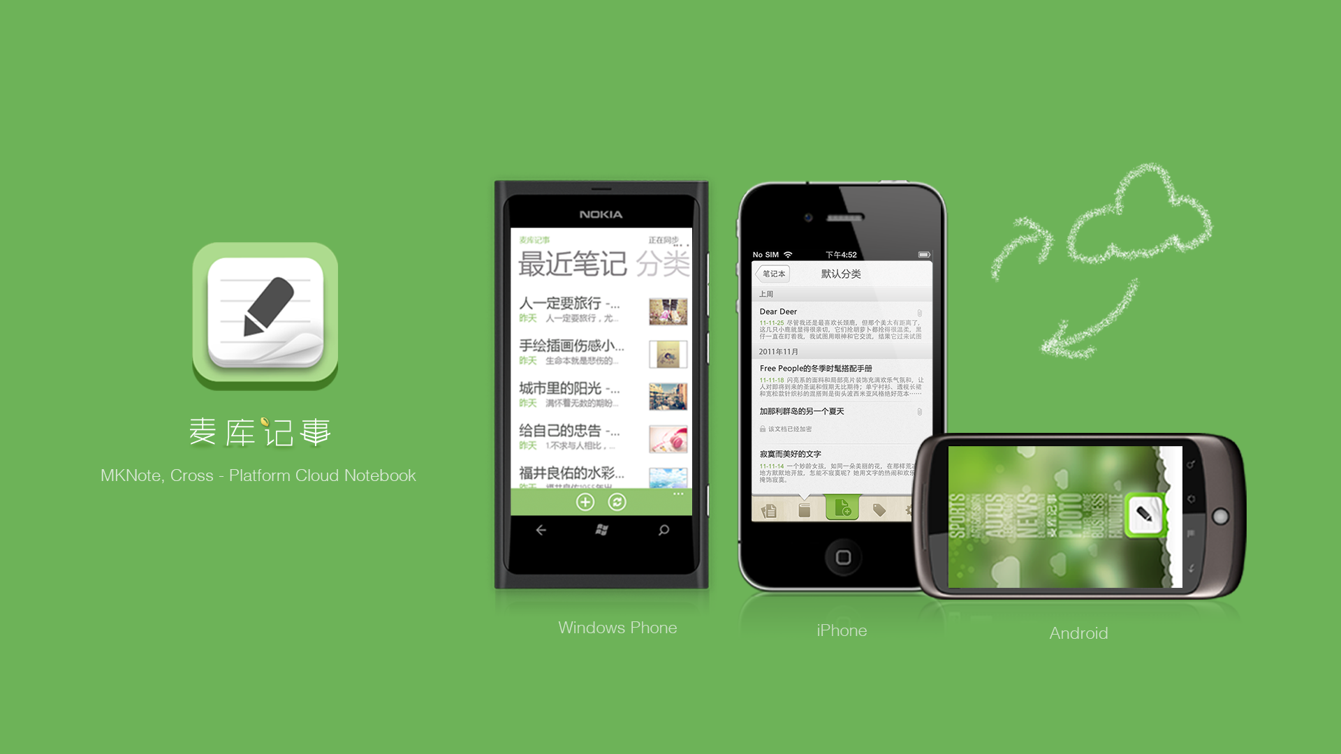
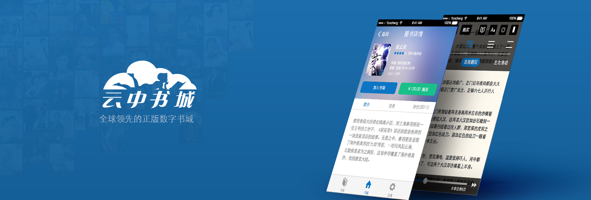
Cloudary Reading – Yun Cheng (www.yuncheng.com) is the largest digital online reading platform in China which owns lots of themed online reading websites, like 起点中文网(www.qidian.com)、红袖添香(www.hongxiu.com)、小说阅读网(www.readnovel.com)、榕树下(www.rongshuxia.com)、有妖气(www.u17.com). Publishers and internet writers could upload and sell theirs books on this platform. Readers could pay and read through almost all platforms including Android, iPhone, iPad, Windows Phone, Desktop, TV and it’s own reading device(Bambook).
Hypothesis & Theory
A successful product must and can establish a good relationship with the users, and the relationship building depends o useful, usable and pleasant that users experience in a product . And from the user point of view, the standas to achieve that is speaking for the users.
Strategy
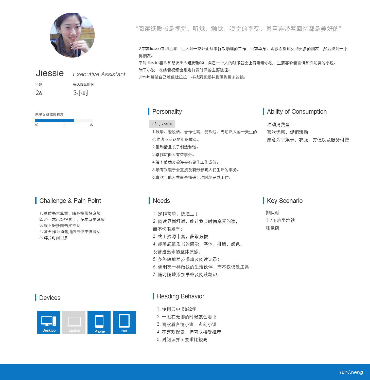
1. Persona & Scenario Analysis
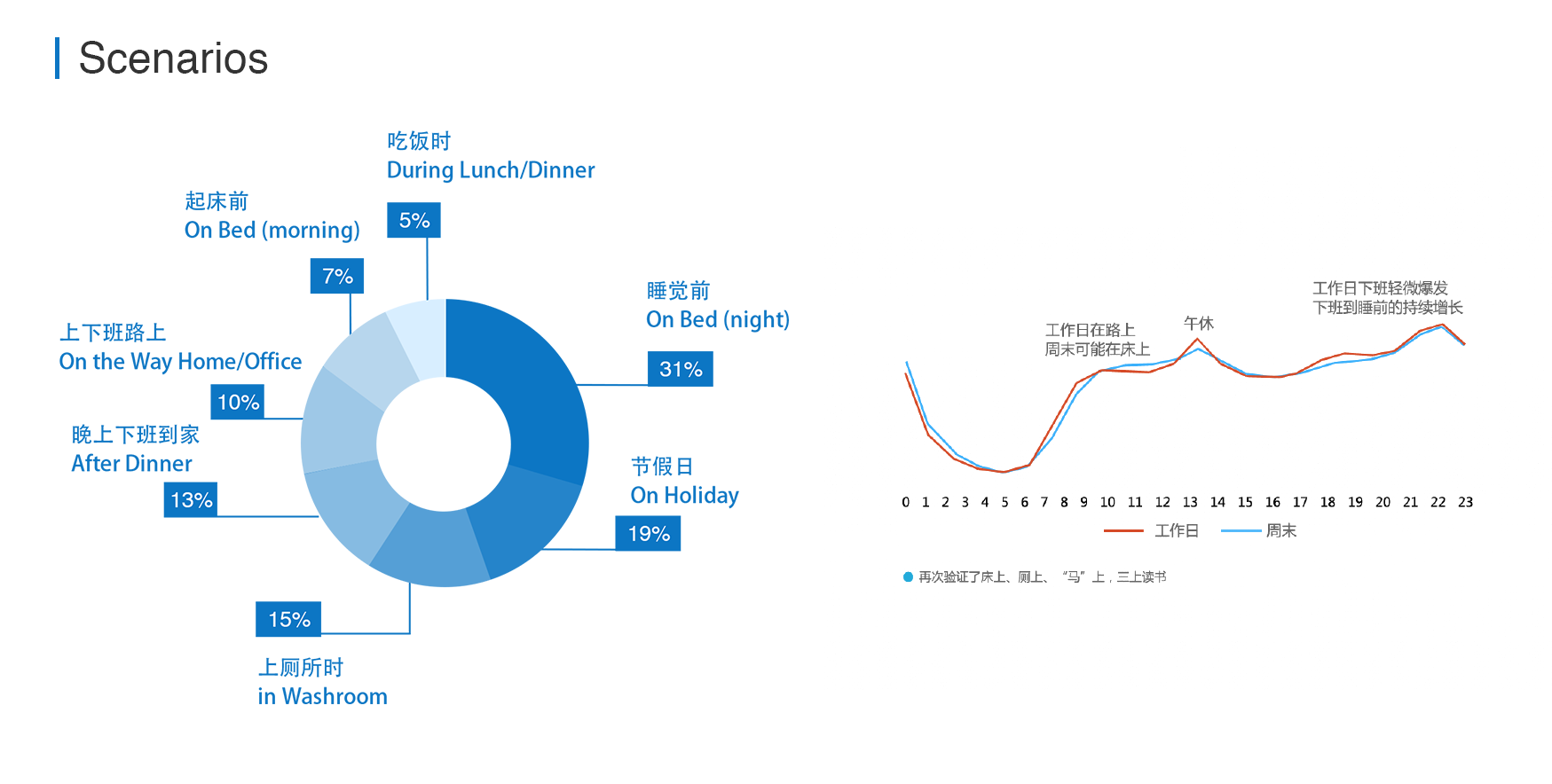
Our user Jiessie is an administration staff who want to read books which she interested in to have fun and relax, especially on the network original science fiction. She reads on the way to work and subway and other fragment time.
1. As user, she tend to read with mobile.
2. As user, she spends most of time to find and read books, especially on reading.
3. As user, she read when she’s on subway, lunch break, and the time before sleeping on bed.
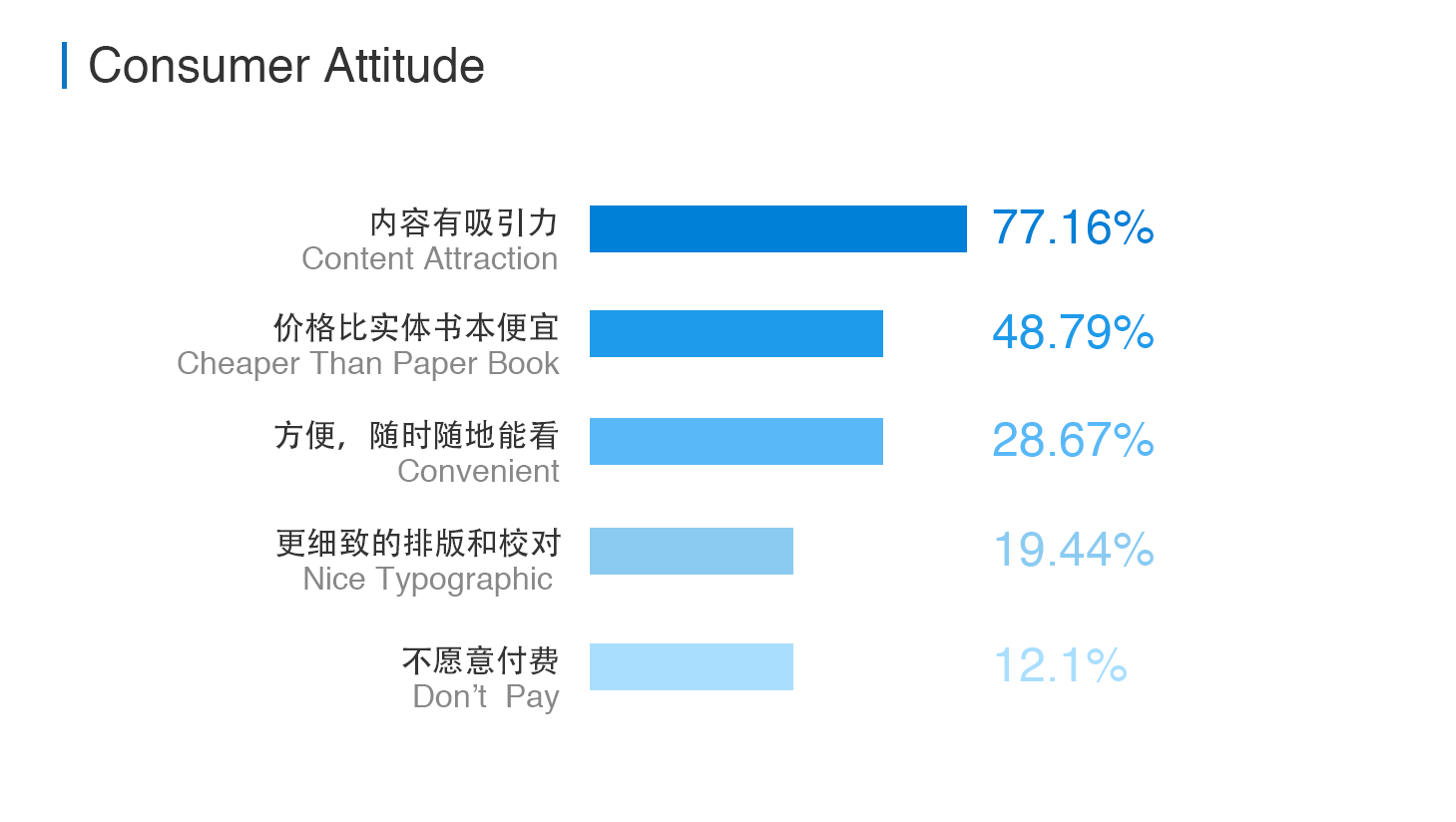
And from SNDA’s “2012 Chinese digital reading data report” which is based on the quantitive online survey data from SNDA users, we could know about our users’ payment attitude:
4. Most users (77%) would like to pay for electronic books, only 12% users don’t want to pay for reading.
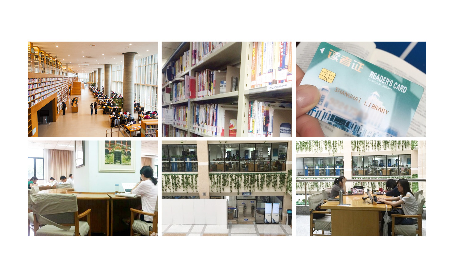
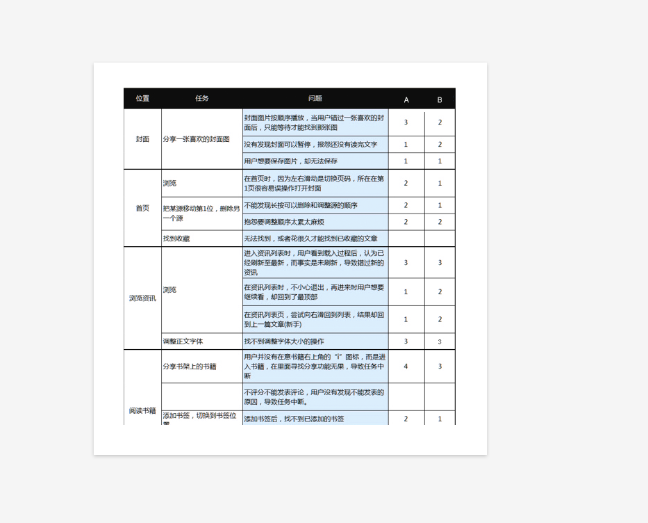
2. Usability Testing
1. At a weekend, our researcher and I went to the Shanghai Library to conduct a small usability testing. We invited 3 readers and offered each of them a gift reading card of our product, and asked the testers to use our current App to find a book she like, then read the book for the first 10 pages and they were asked to pay for the rest content with the gift card. In addition to this testing, we also interviewed them about why they love to go to Library.
Why Library?
a. People feel relaxed about the large space in Library with tons of books and magazines. (Useful)
b. With clear space division, people could find the book they want very soon.(Usable)
c. People love the reading and study environment in library. “I feel comfortable and engadged with people reading around.” (atmosphere & emotion)
It would be great if we could make our users feel the same way and engaging when using Yun Cheng App.
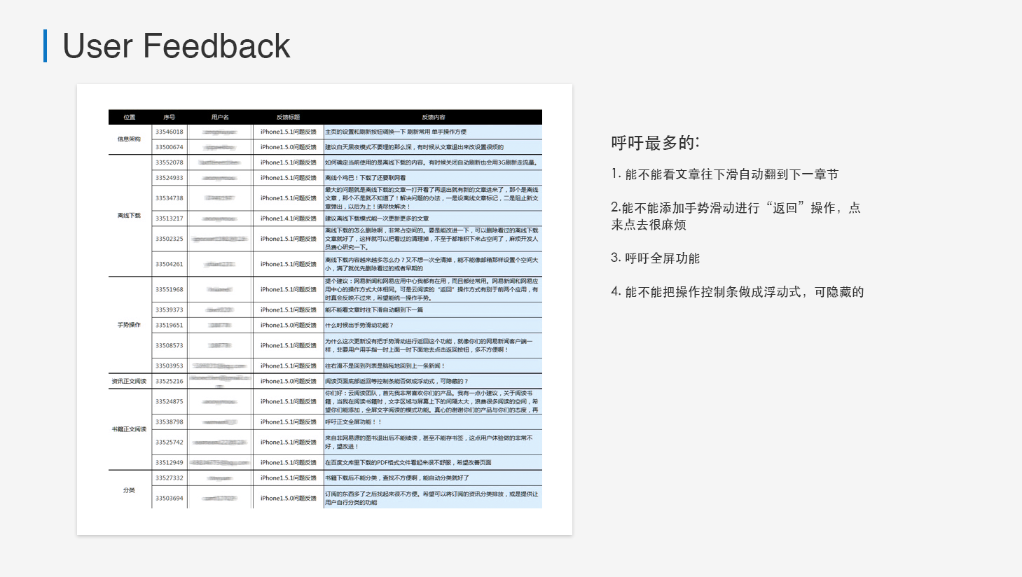
3. User Feedback Analysis
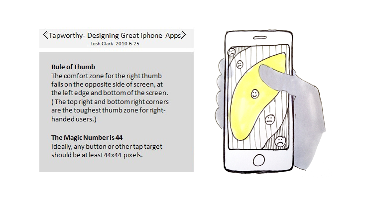
I found users care a lot about the gesture from users’ feedback. Since they usually hold phone with one hand, swapping is better than click the buttons far from fingers reachable range.
As Josh Clark noted in his book “Tapworthy -Designing Great iPhone Apps” 2010, 2 rules in iPhone gesture design – Rule of Thumb & The magi Number is 44. And from some of the research for past years that users who interact with their phones holding them predominantly in three different ways:
• one handed (49%)
• cradled (36%)
• two handed (15%)
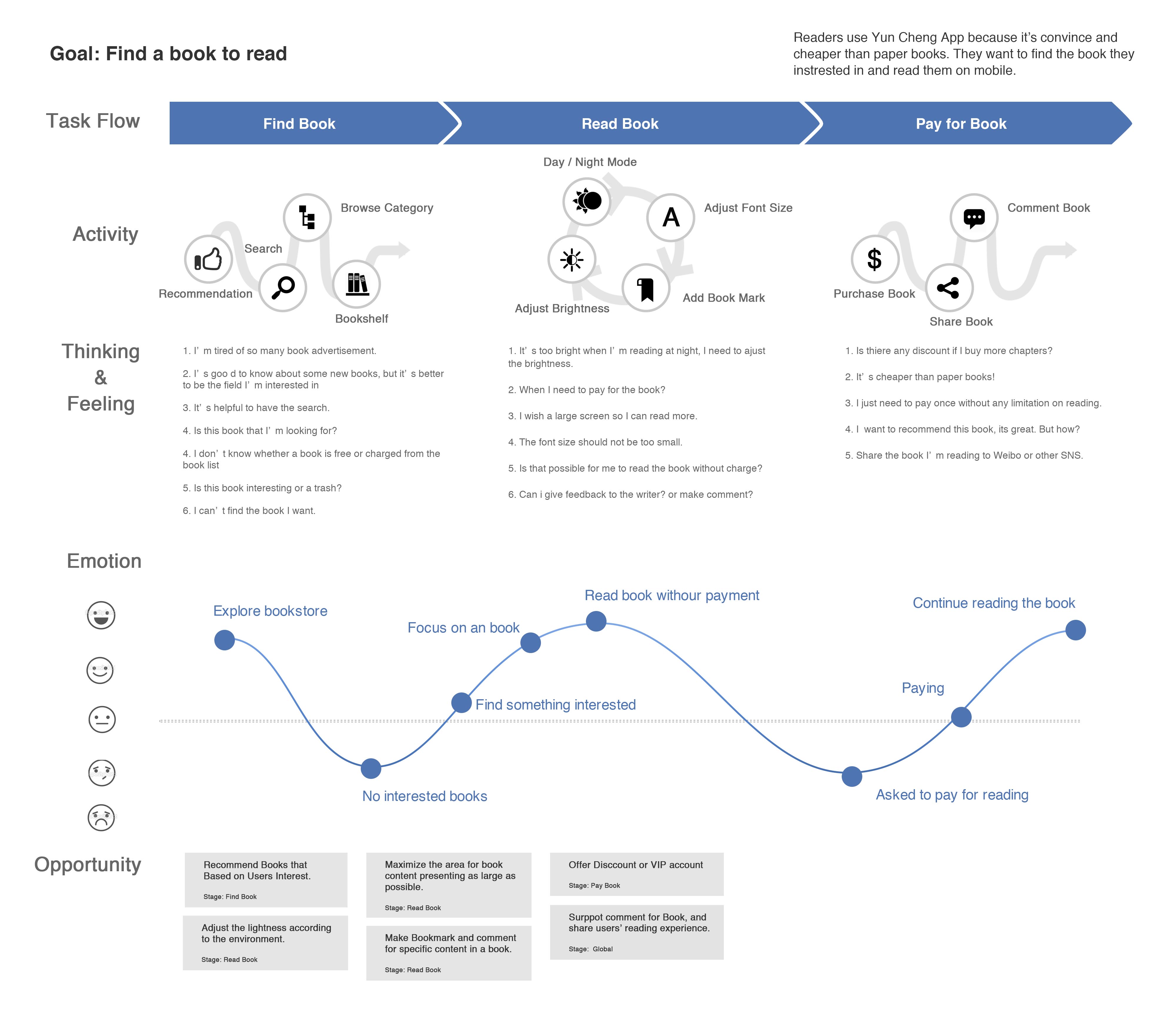
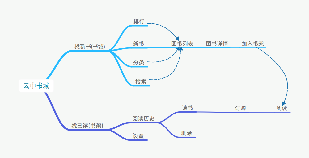
4. User Experience Map (User Journey)
By interview with users, users feedback, I made user experience map combined with user journey. It helps all stakeholders to get an overview concept about the users flow, how the users achieve their goals and what they might think and feel.
1. Find Book – The quality and quantity when they try to find new books that they are interested.
2. Read Book – The experience during reading a book.
3. Price – Read without any charge or charged.
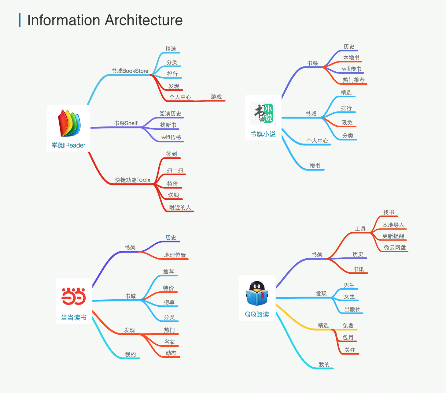
5. Competitive Apps and Analysis
Compare 4 applications'(QQ Reader, iReader, DangDang, ReadFlag) architecture apps are all build based on 2 key features: Bookstore and Book Shelf.
1. Information Architecture
云中书城 Yun Cheng APP
Other APP
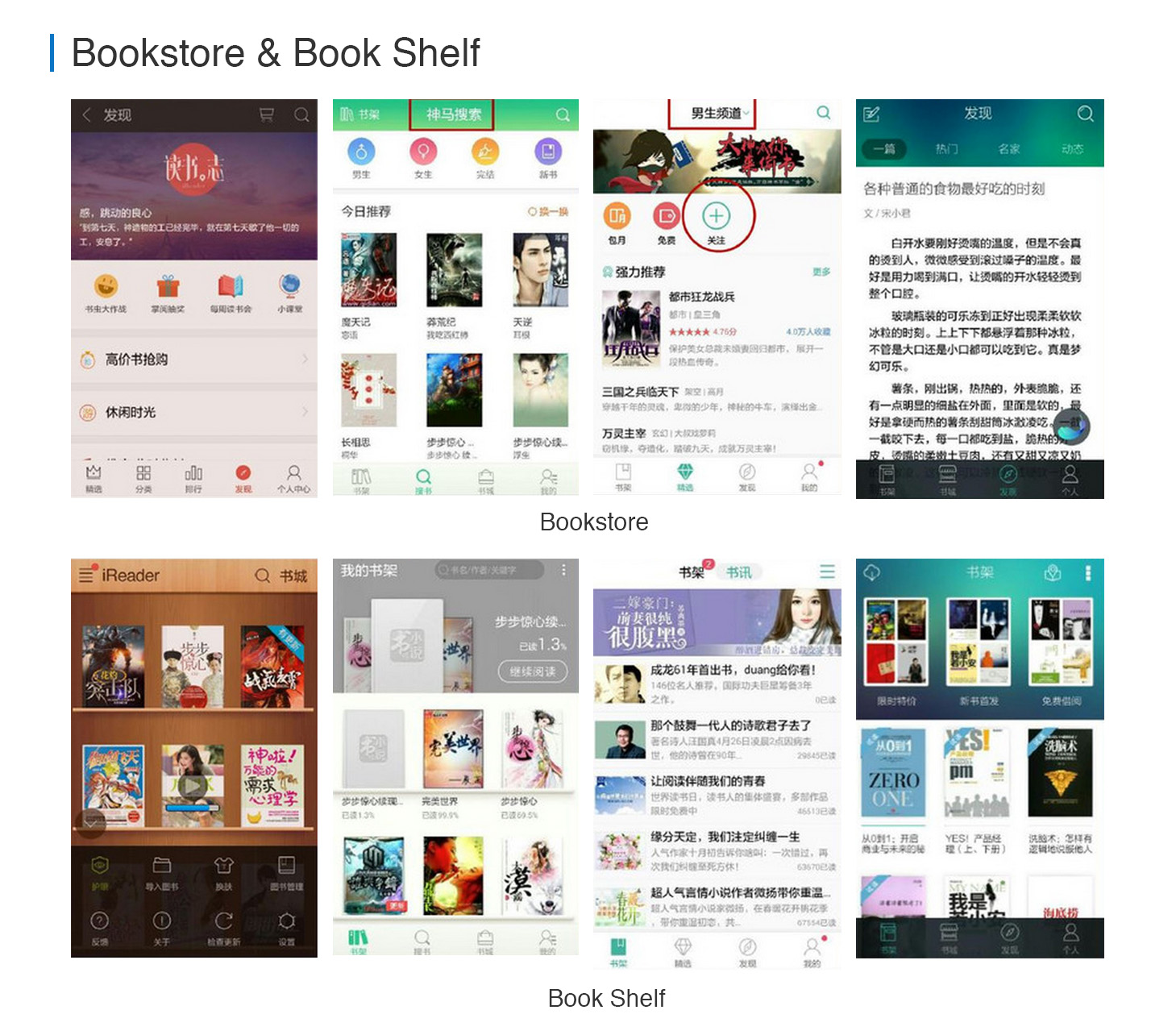
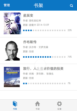
2. Bookstore and Book shelf
In Comment:
Bookstore – Find Books
• Users love to find books that are hot so that they aren’t out of fashion
• Users love to know the newest books
• Users love to find free books
Book Shelf – Read Books
• Users spent more time on reading a book than finding a book
• Users need to start or stop reading anytime at any point
Inspiration:
Too much information in bookstore would not help users to find what they want. On opposite, too much information will distract users’ attention.
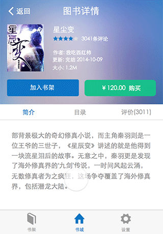
3. Book Detail View
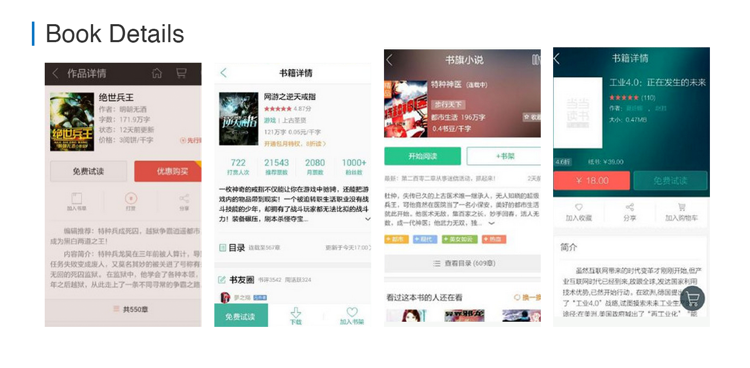
In Comment:
Book Details – Summary of Book
• Users need to know something about the book to decide read or not
• Start Reading” and “Add to Shelf” are the 2 key features
Inspiration:
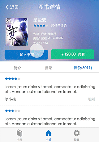
• Comments from others might be helpful for user to make decisions
• Users may give tips to the writer but is it a good idea to put the feature in the Book Detail View?
In Comment:
Book Details – Summary of Book
• Users need to adjust brightness, font size and catalogue
• Users need to switch from day mode to night mode
Inspiration:
• The bookmark would be helpful
• The color and contrast between words and background is important
• It’s better to offer a large reading area for users
Improvement Solutions & Design
These varied research and strategies helped us to quickly gain insights into the pain point of our users and gave us a leading on the user experience improvements.
Remember my theory – we need to design something useful, with nice interaction that balanced with the users’ emotion.
Find Book Improvement
1. Navigation – Clear and Simple
In current version, the bookstore and book shelf are totally separated. Book shelf is set as the default view when users launched our app. We used the flip interaction for users to switch from bookstore to book shelf view. This looks cool but it has a lot of pain points with this structure:
• If users want to search a book, they have click at least more than 2 steps, back to the shelf and to go the bookstore, and then find the search button.
• Users could have a overview on the structure of the app.
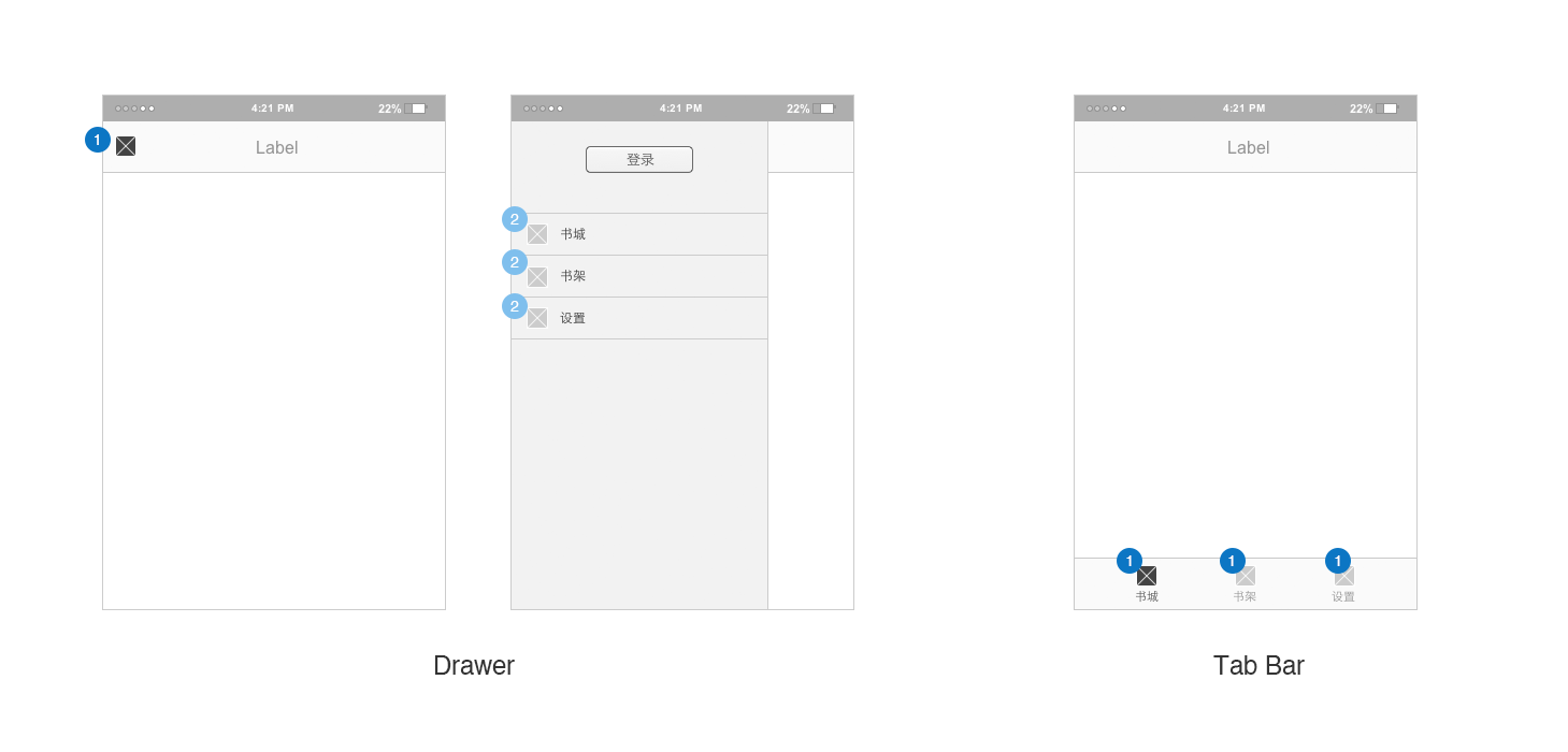
I redesign the navigation, and tried 2 solutions, the “Hamburg Drawer” and the classic iPhone tabs.
Drawer
• The advantage of drawer is saving the screen space for users. Without the bottom tab navigation, users seems to have a larger view.
• The disadvantage of drawer is the position that the “hamburg” button, it’s on the left-top corner of screen, that is the place where users fingers are hard to reach when they holding their phone by one hand.
Tab Bar
• The original bar element. From research we knew that our users prefer to use one hand while reading in our app. With this tab bar, users could easily handle all the features – switch from views with one finger.
• And users were used to this classic bars, they don’t need to learn.
• Tab bar flattens the of hierarchical of views presenting all the information in front of users.
2. Bookstore – Try Before Buy
Users are passive on receiving new information. We have a “Recommendation” channel in our bookstore, it was presenting advertisement of books, topic, hot and “Guess you like”. It was functional but have some pain points:
• Full of information listing there distracting users’ attention and looked cold.
• It’s hard to really recommend the awesome books to users.
I wanted to push a bit forward to help users to learn about books they haven’t read and helps us to sell the books for business needs as well. So I redesigned the “Recommendation” channel in Bookstore:
• Removed pops that advertising books to users.
• Removed bunch of flat book list which looks bored.
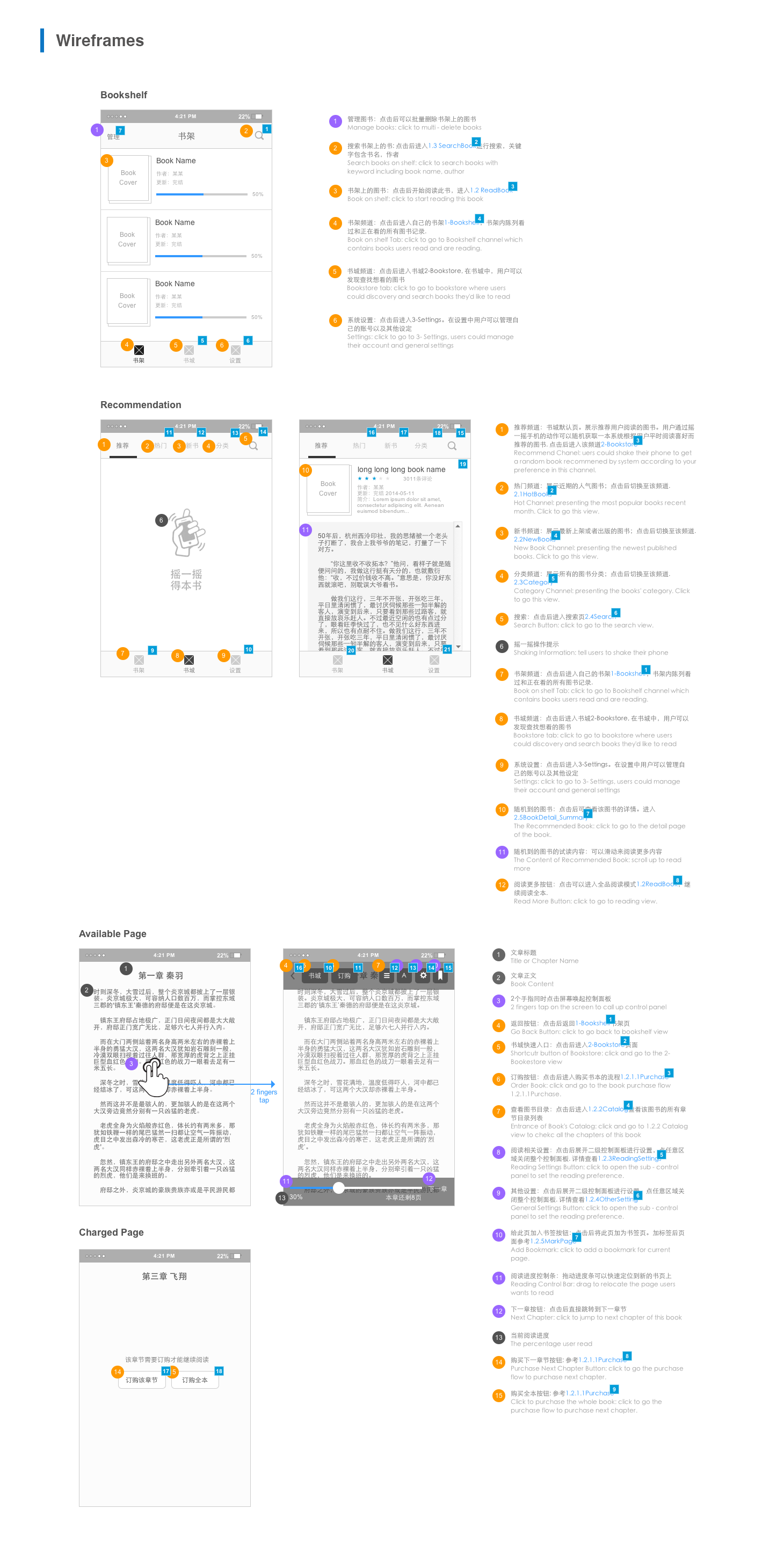
I made a large area on screen for “Guess you like” which now is presenting a few content of a book. The book is random picked from our book data according to this user’s interest (what kind of subject he/she usually read on our app). And users could shake their phone to get a different book. This made the “discovery books” easier to be approached.
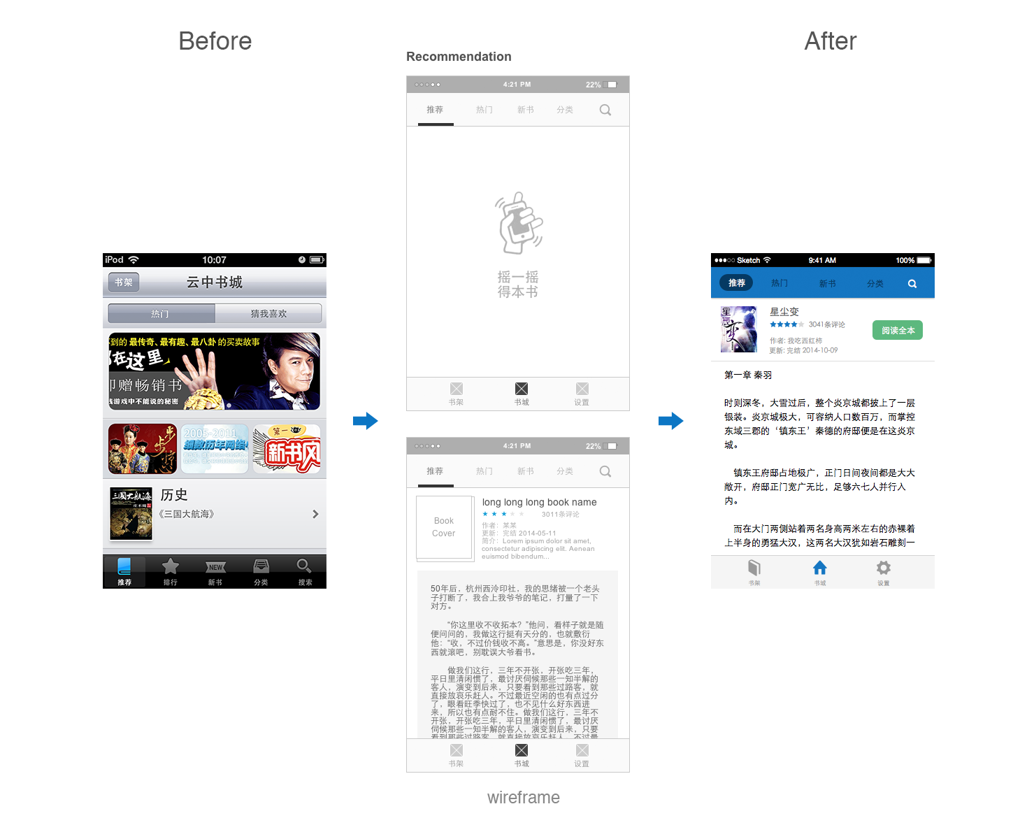
And we did usability testing on this feature, tester thought this idea is nice and shaking to get a book is interesting.
3. Category – immersive experience
There were many categories of books, and we segment these categories in to 2 chanels: “Traditional Literature” and “Internet Literature”. And we used to present book categories in a flat list. But there were a few disadvantages:
• The flat list could not immersive or engaging users.
• The fat list takes show few categories on screen.
I designed scenario card list instead of flat list to elevate the human touch in the design. I also listed sub-categories on each card to make sure people have a better understanding of the types of books they would discover. For example, under “Science Fiction” we listed 超级科技, 古武机甲, 进化变异, 末世危机, 时空穿梭, 数字生命, 未来世界, 星际战争.
Considering most of of users are the internet literature readers that matching our business direction, I made internet literatures as the default chanel.
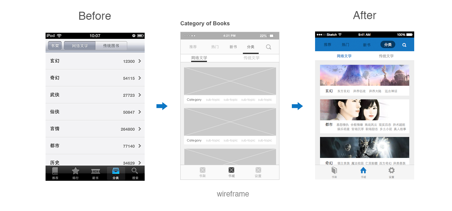
However this design do have disadvantage from our usability testing after design, it might make the list longer. So we don’t implement the card list in the released version.
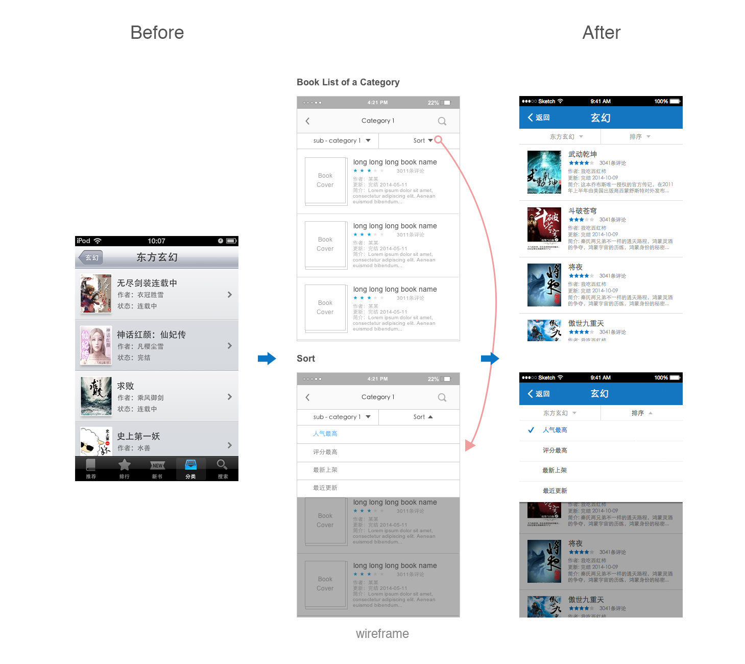
4. Filter & Sort – advantage method of finding a book
We also used flat list for search results. But it also had a disadvantage:
• Few filters for the book list after users searching or selecting a category. As a result it was hard for users to decide which book to read or add to their bookshelf.
So I added filters and sort to make our search results and book list a lot more accurate. With filters users could choose to view book list only of free books. With sort of books, users could view by the latest updated, most popular or highest scored books. And I put search button inside each category view so that users could stat search on any view and don’t have to go back to the bookstore homepage.
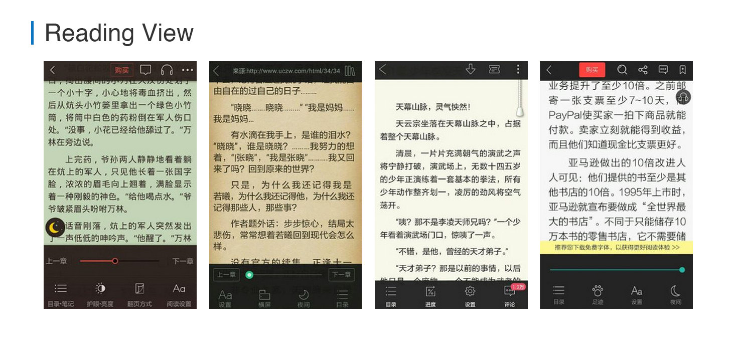
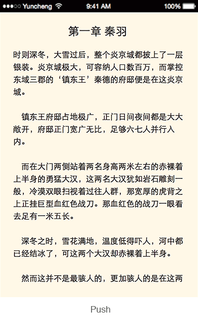
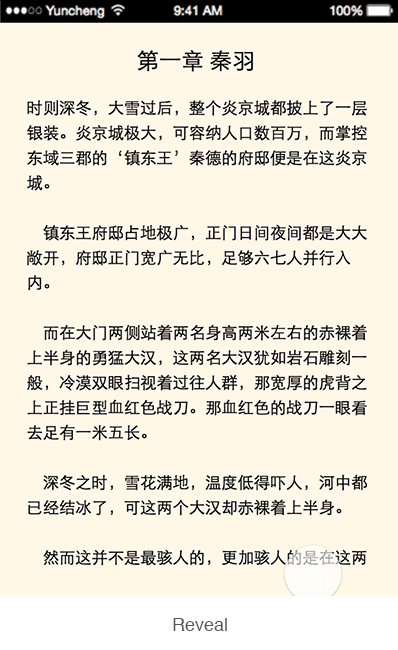
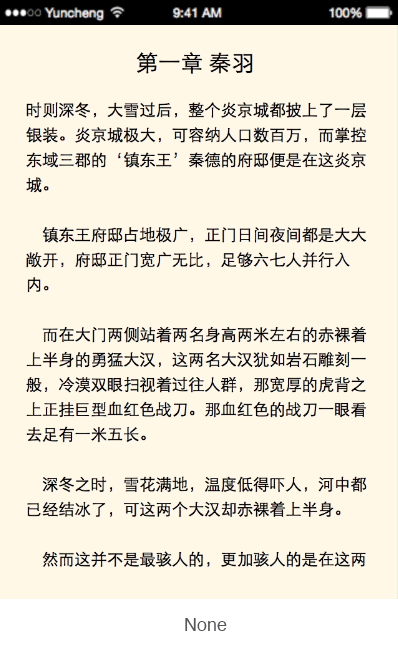
1. Gesture – Optimize gesture on reading view to make reading experience more efficient and convenient
In the old version, we set “swapping with one finger” as the gesture for users to flip over a page. Swapping to the right will go the next page, swapping to the left will go previous page. Clicking to flip page was another choice. In clicking mode, we divided the clickable area half to half. Users clicked on the left screen will be led to the previous page and on the right half screen will be led to the next page.
But from our usability testing and users’ feedback, we gradually found this is not the best gesture for flipping during reading:
• Since users always hold phone by on hand reading on subway, bus or bed. It’s hard for users to swap under these condition.
• Flipping page is a high frequency operation during reading, swapping all the time really hurt finger.
Improvement solution:
• Use “Tap” as the default gesture on flipping a page instead of swapping. Tapping is more easy to operation with one hand holding the phone under any condition.
• Tap any place on screen will go to the next page. In most of time, users need to go next pages not previous one.
• Keep swapping to the left as the gesture to go to the previous page. Compare with the time users spent on flip to the next page, flip back to the previous page is a low frequency operation.
• Removing animations during flipping page, it annoies users a lot.
• Use “2 fingers tap” as the gesture to call up the control panel on reading view.
I had interviews with our users and designed different animations for testing. We asked users to watch each animation for 3m and recorded their feedback. The result was that during frequently flipping pages with any kind of animation, users are easily to feel tired both emotional and their eyes…
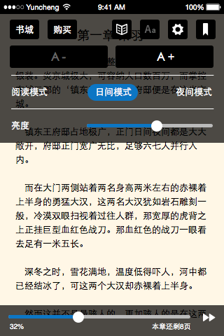
2. Reading Mode – be smart
From analysis scenario, most of time users are focusing on reading the book, and users noticed to change to the night mode only when they feel it’s too bright.
I suggested to offer auto switch the “day mode” and “night mode” for users when the phone captured that there’s no enough light.
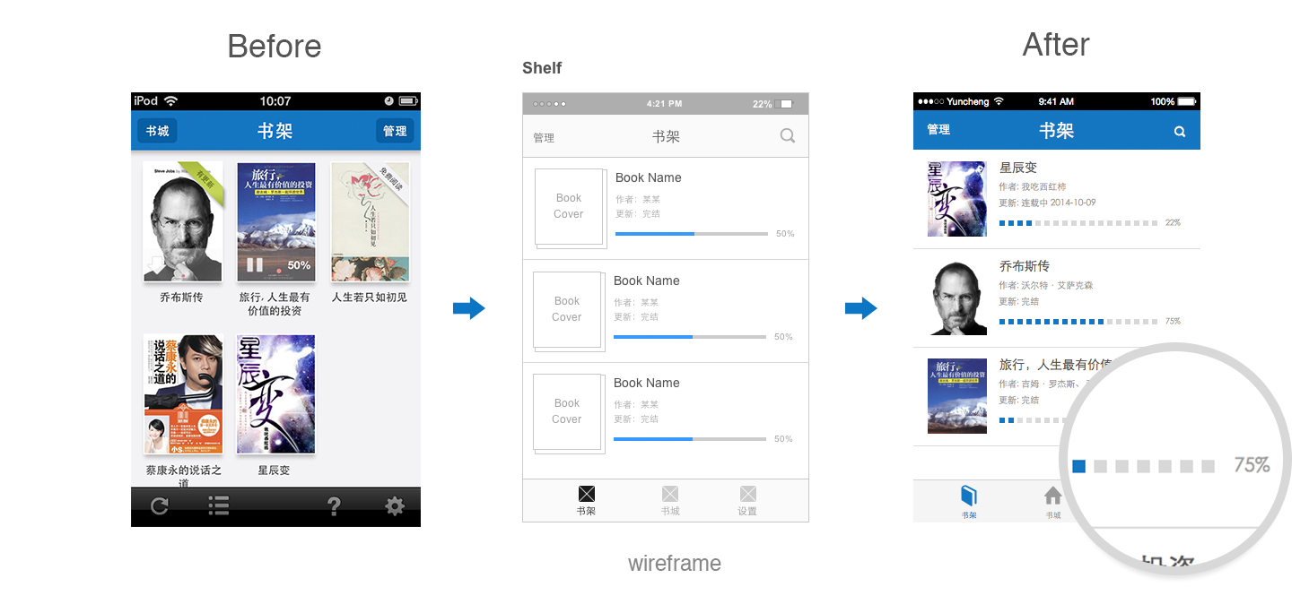
3. Relaunch – be sweet
From user interview, we found that most time they spent on our App is reading and the rest is finding books. In current version, if users wanted to continue read the book they’ve read before, they need to:
1. launch our APP
2. go to bookshelf
3. choose book
There were too many steps before to approach reading. I suggested to directly call up the reading interface and locate at the page which users read before, instead of going to bookshelf.

4. Reading Process
By adding a process, users could tell where were they during reading a book.
Offline Order
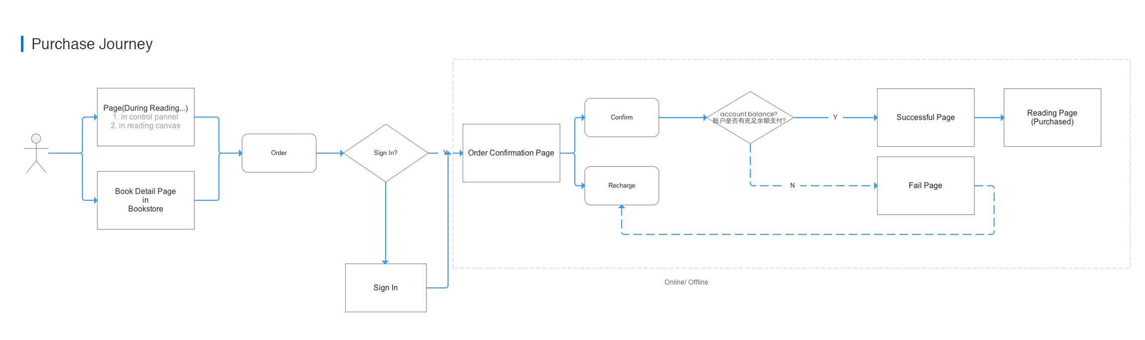
We offered online order for books, but during our interview, we found some users read in a no wifi environment and they might want to order the rest of the books or buy whole book. Such as on plane, on train, on subway… With only online order flow, users could not continue reading at anywhere by anytime.
So I suggested to add the offline purchase flow. In the offline purchase flow, the whole book would be transferred from server and saved in the user’s phone cache after user had added the book to bookshelf. And whenever the user wanted to order this book, the book could be available to read at the time the users pays offline. All the purchase flow could be done without network, and once there’s a network, our app will communicate with server to update the order information.
1. Wireframe
Share an experience, use AxureShare to upload the *.rp document to the server, engineers could open the address generated by Axure directly in a browser. Whenever the design changed, engineers could also be able to see the latest updated design. It’s no longer necessary to wrote an email with attachments back and forth, reduce the communication cost.
Online wireframe: http://3xper2.axshare.com
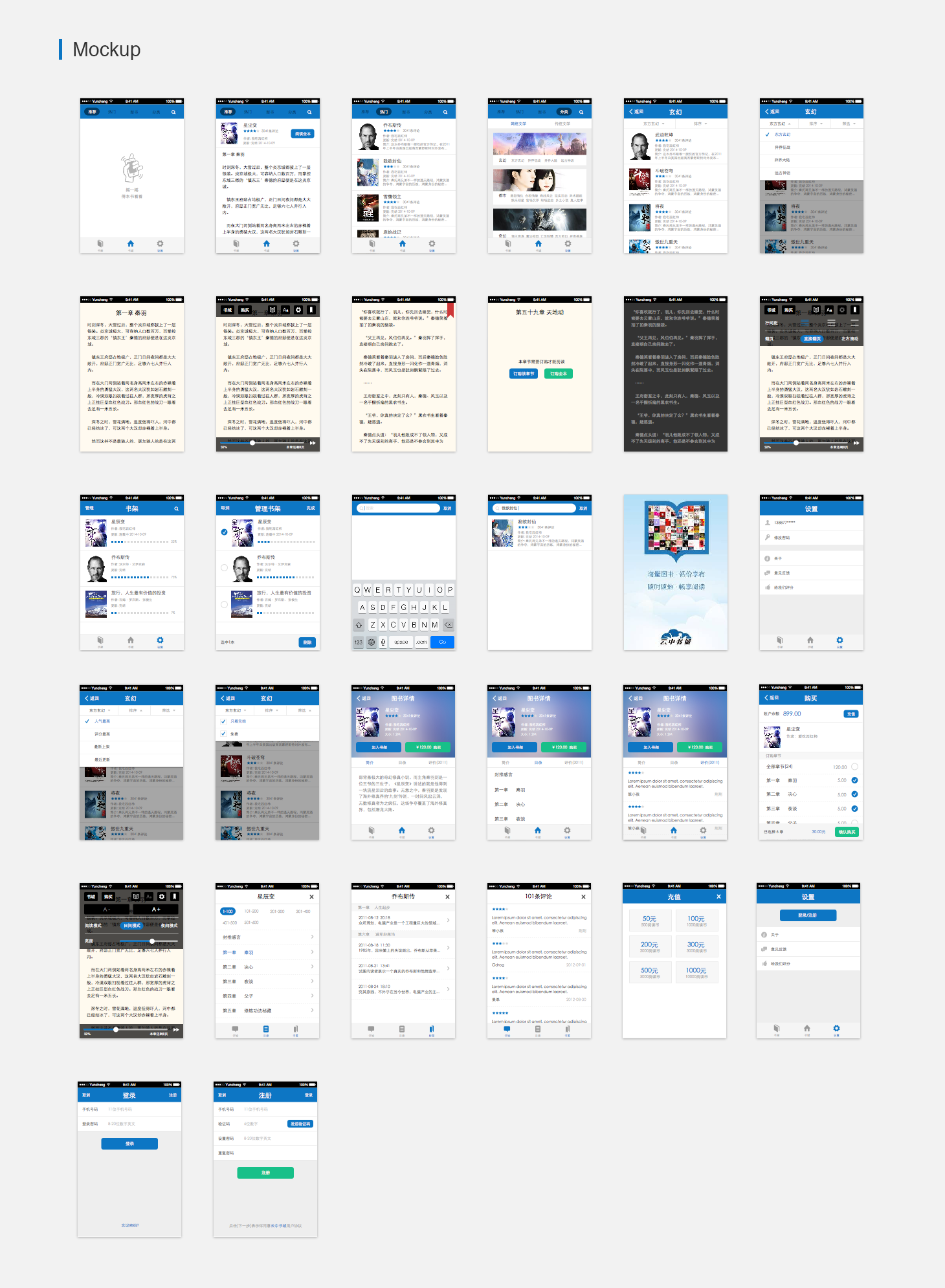
2. Mockup
I used the Yun Cheng blue #0C76C4(12.118.196) as the main color. Tried to deliver a clean and simple look.
3. Prototype
Online prototype: http://invis.io/SZ3NFS7DH
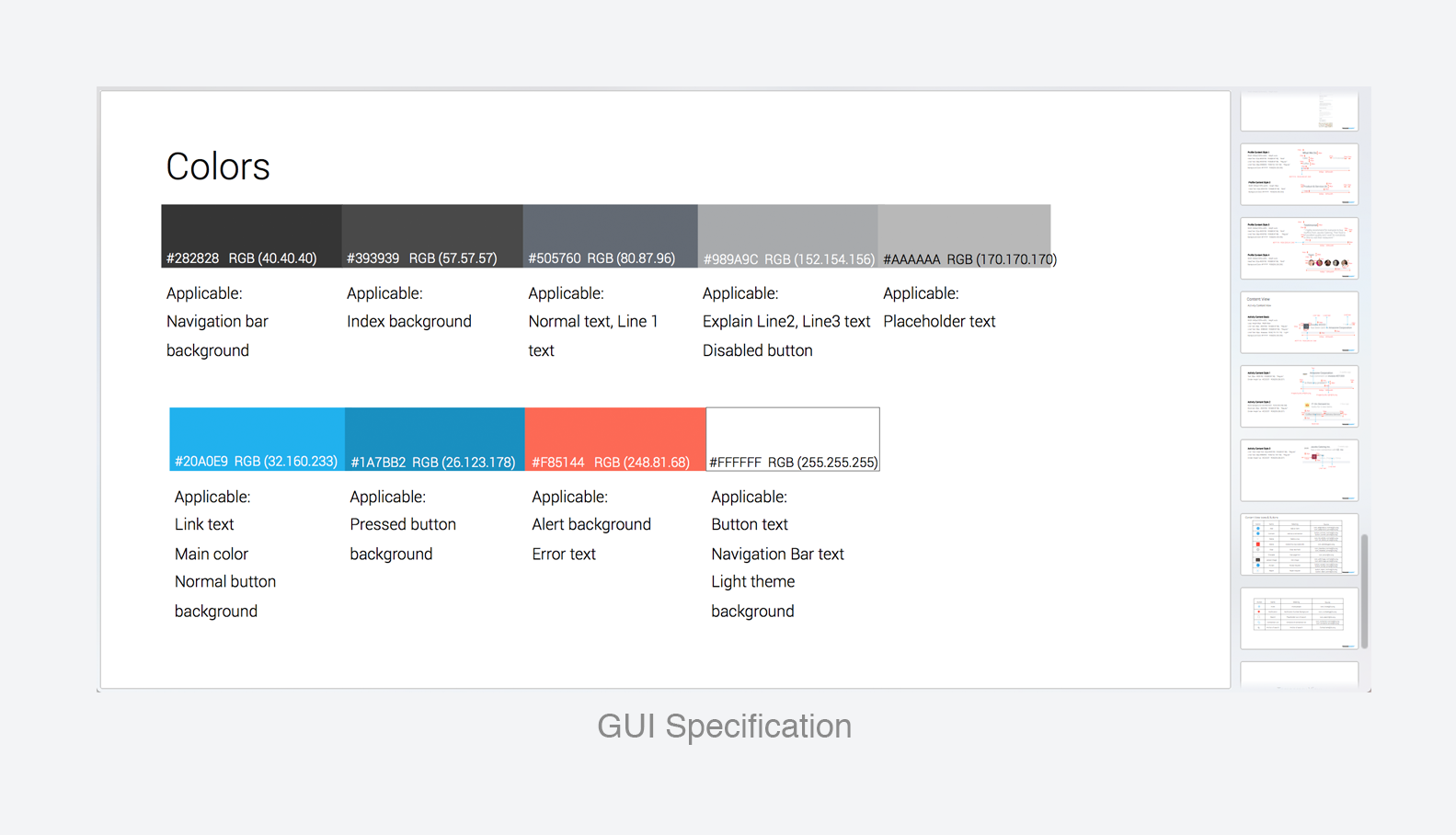
4. Specification
I made the design specification for this app.
5. Animation
After delivery design proposal, I need to face the challenges from pm or others. Insisting or compromising? Here are some principles:
• During the discussion people might challenge your design according to their own needs and imagination. The designer should try to explain the story behind the design from several aspects, like the audience, scenarios, user experience.
• Developers might bring up extreme possibilities to question design. Designer should try to explain that our app is designed to satisfy major users.
• Developers might suggest from the system performance, implementation cost and technology limitations. PM might suggest from business priority. In these conditions, designer might need to compromise, because our goal are the same, to delivery a great product. Sometimes, designer need to work with limited resource but to maximize the design.