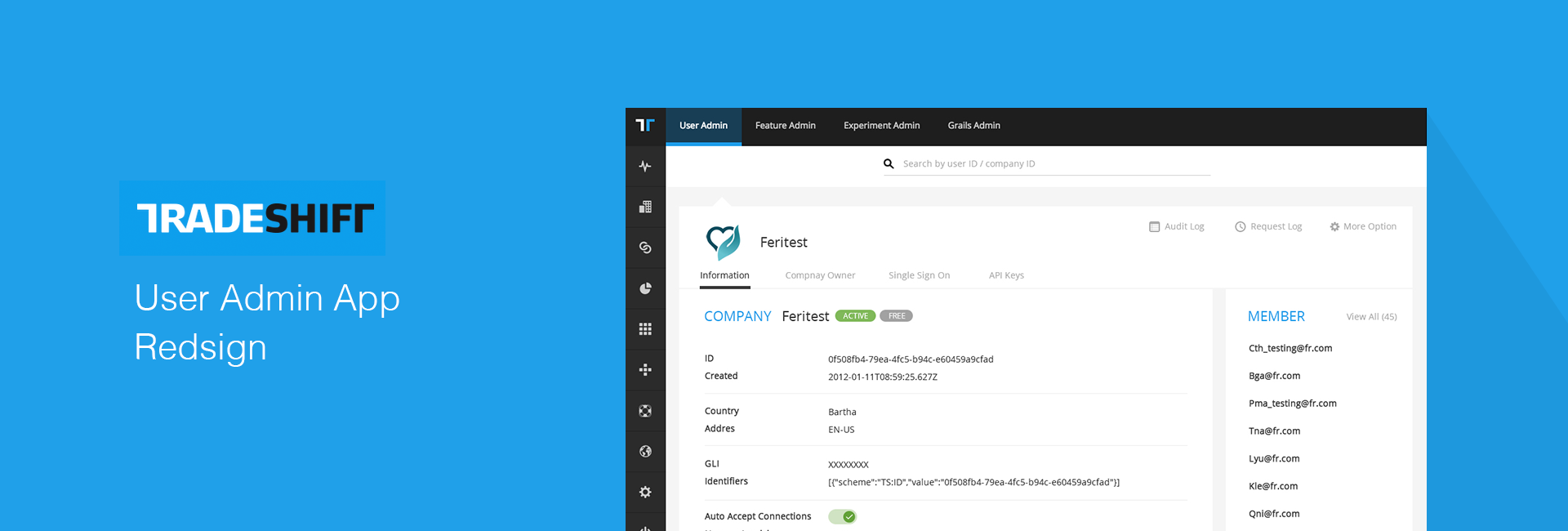
Project Background
User Admin App is a internal app for Tradeshifters who need to manage all Tradeshift users.
Project Objective
The objective was to design this app, To make the user experience more intuitive, user friendly and delightful – less code like.
My Role &Team
I’m responsible for the design with a PM and 2 engineers.
Tradeshift (www.tradeshift.com) is a cloud platform that connects buyers, suppliers, and all their processes in one place. Tradeshift integrates ERP’s strong suit – financial data – with the rest of your supply chain processes. And it’s transforming buyer-supplier relationships and having fast supplier onboard through:
Electronic invoicing, CloudScan, Collaborative Workflow, Supplier Management, Working Capital Solutions, Business Applications, Connected Business and Global Compliance.
Design
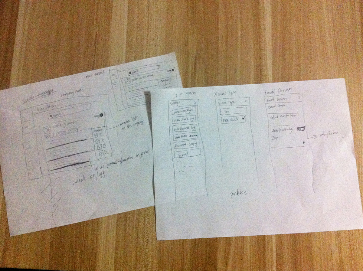
1. Concept
During the design process, I explored with our PM on possible metaphors for the user experience of this functionality in rapid sketch form. This allowed us to generate a body of ideas. This rapid sprint process took the following form:
Defining business goals
Defining project goals and how those tie back to the business goals
Defining user goals
Translating business and user goals into high level UI requirements
The output was some early proto-pages that included explorations of navigation models and content regions. These were then used to guide higher fidelity wireframe and visual design explorations.
1. Visual Mockup
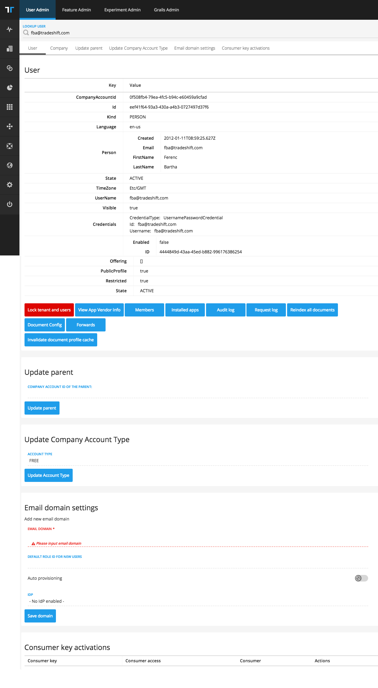
Here are “before” and “after” pages along with some high level examples of output from some key activities that helped us to ensure that we were on the right track to deliver a better “User Admin APP” user experience.
User Admin App was served on a single long page that provided a rollup of all possible settings and some code that user might don’t understand. Here are pain point:
• From a functional point of view, too many buttons were put on this page. It’s hard for users to find their settings and they might get lost easily.
• user experience was compromised to allow for all of this information to exist on one page.
• While the page had some logical chunking, the experience lacked clear orientation.
The page was also lack of some visual hierarchy, categorization and explanatory text.
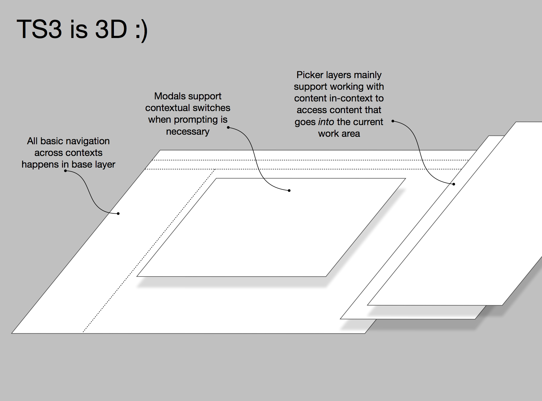
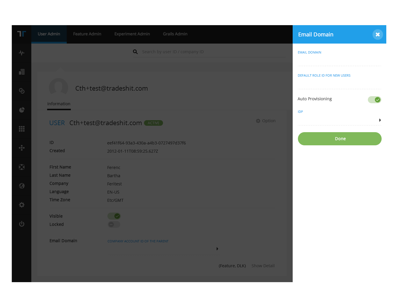
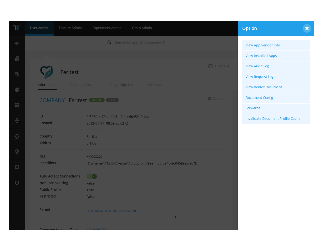
After some discussions, we determined that having 2 main logical buckets of content, use the main hub and picker which consist with Tradeshift design principle. would help to improve the user experience by limiting the amount of content on each page. The site would then consist of the following sections:
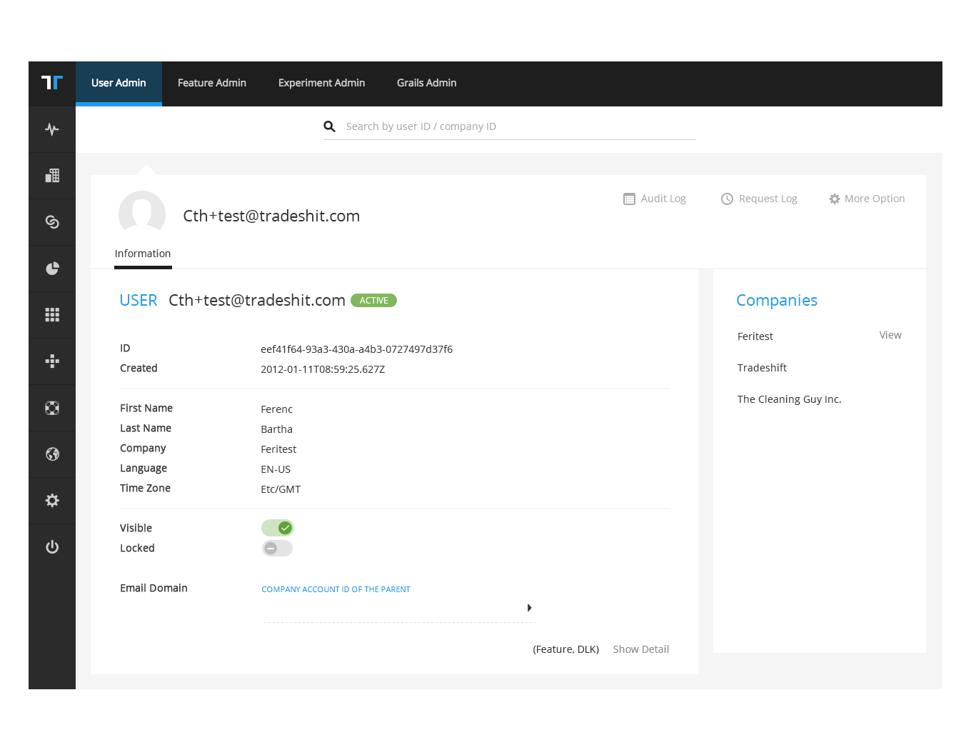
MainHub
Contains the general information of a user’s account and every setting option
Picker
• Email Domain – Contains anything related to security, password, and device settings
• Account Options– Contains additional options
Account Preferences
Contains additional user preferences, like language and locale.
We removed most of the buttons, used picker for next step operation and group of information. So that they could clearly know the logical in this app and get a clue what to do next.
A user friendly and approachable result
By taking the above steps, we were able to deliver not only a simplified “User Admin APP” user experience to users, but to envision this functionality in a friendly and approachable way that would be easy to use for the target audience. The final result was a series of pages with a clear visual hierarchy, clear and logical information grouping, easy to use and friendly copy text that clearly explained.