Overview
Highlights
Challenge
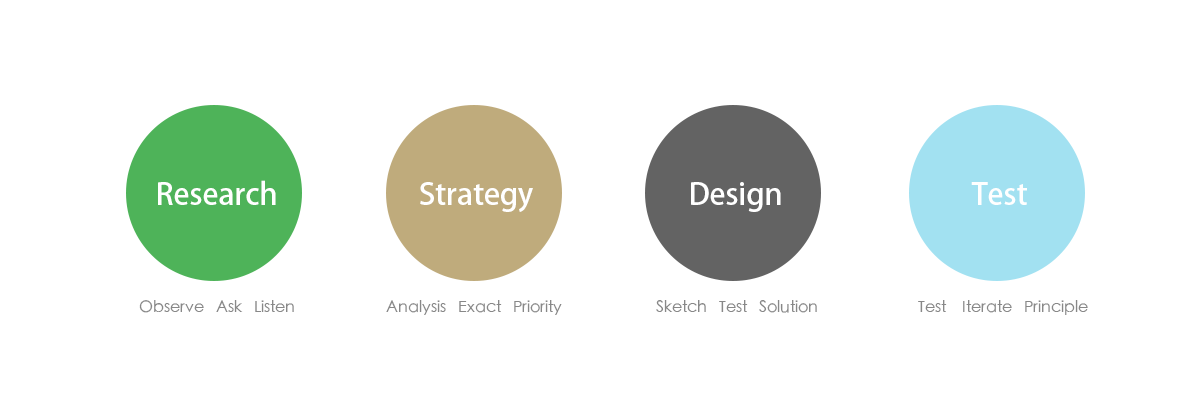
Approach
– Research
– Discovery
– Strategy
– Design
– Implementation
Impact
Lessons
Project Background
This is a time that information exploring. It’s predictable that we can not only rely human brain to absorb and remember everything. And at meanwhile, electronic document is replacing the traditional way to save information, like people today are getting used to write with office document apps. And today it’s a time not only PC is the device but also our smart phones, so this brings new market – cross platform note application.
“There is a need , there will be a market .”
Project Objective
2011
The objective was to build a product that users can save, create, manage and browsing notes including photo, text, sound on their devices. Data could be synced cross platform with “Cloud”.
My Role & Team
I worked as the lead UX designer as the first designer joined MKNOTE product team, I worked with an user researcher and visual designer for the product’s whole life circle.
Deliverables
• Research (Survey/Usability Testing)
• Strategy (Persona/Scenario/Story Boards/User Story Mapping/User Experience Map)
• Design (Brand VI/Sketching/Wireframe/Prototype/Visual Mockup/Specification/Redlines)
Tools
Photoshop, Illustrator, Axure, Office Suit, Dreamweaver, After Effects
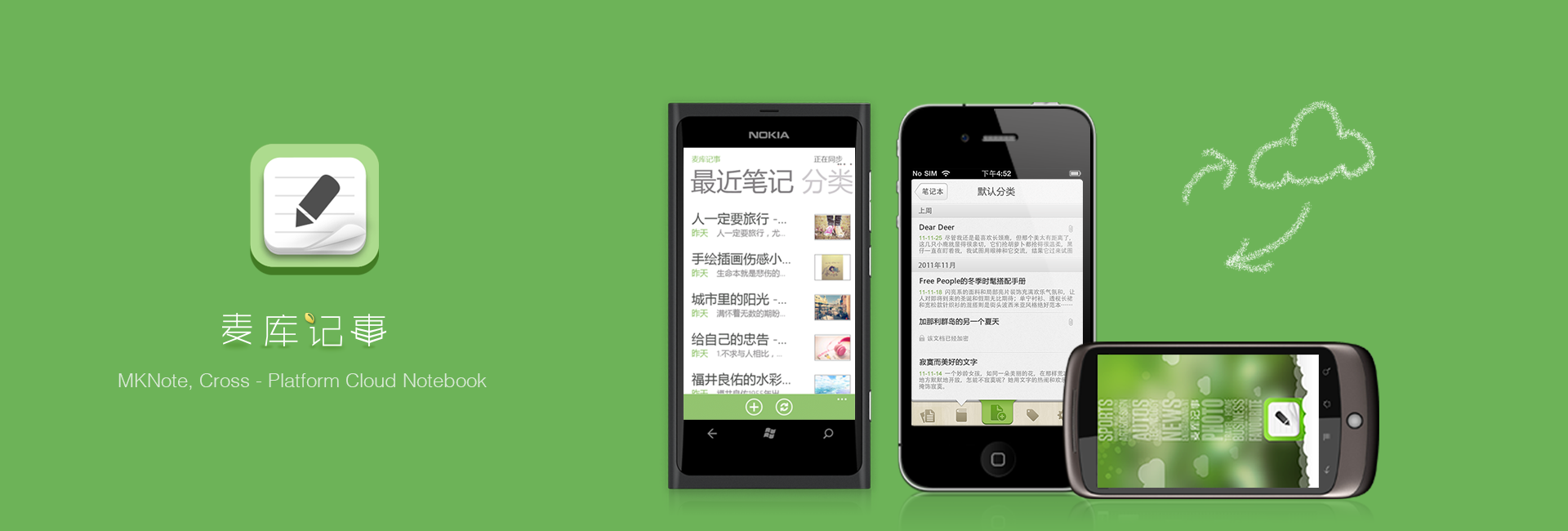
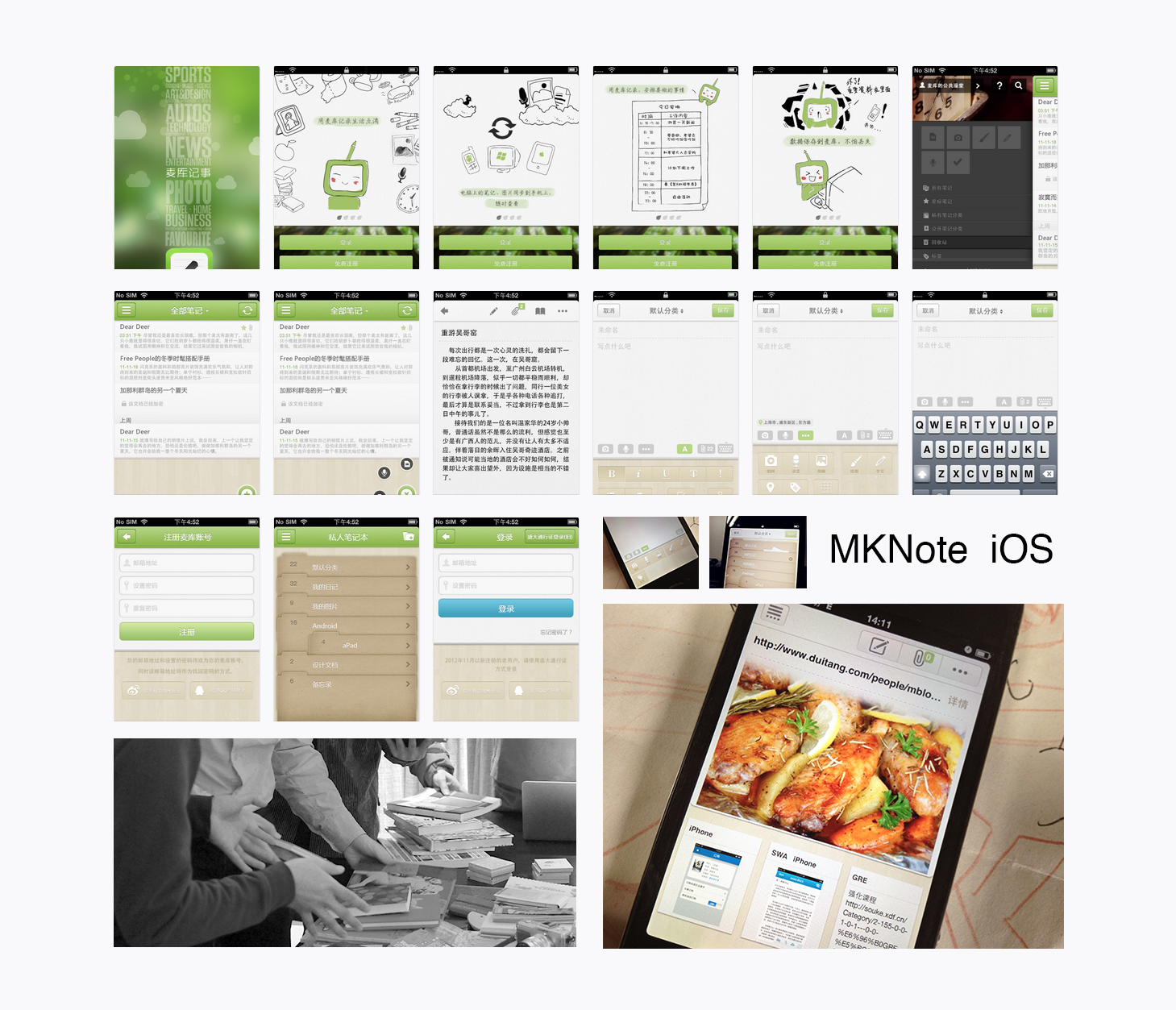
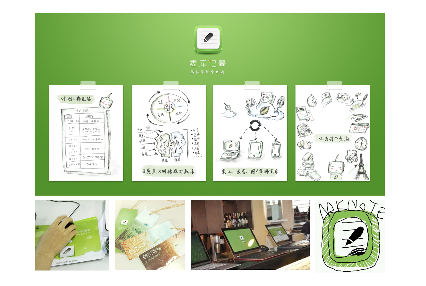
MKNote(www.mknote.com) is the first cross platform personal cloud notebook in China market.
It is available virtually everywhere, including phones(iOS/Android), desktop(Windows, Mac), website and chrome plugin. Users can create notes, record sounds, save photos, capture inspiration, and share ideas all from within MKNote. Notes are constantly syncing so that if you captured something on desktop, notes will also be available on your phone or other device, and vice versa.
Helped to build assistant system for users. 2012
Helped to build users’ feedback channel. 2012
Collaborate with Intel to create MKNote Windows 8 app for Intel Ultrabook in China Market. 2012
Designed MKNote Official Website, 2012
Designed Mac OS App. 2013
Designed Windows Desktop for XP/7. 2013
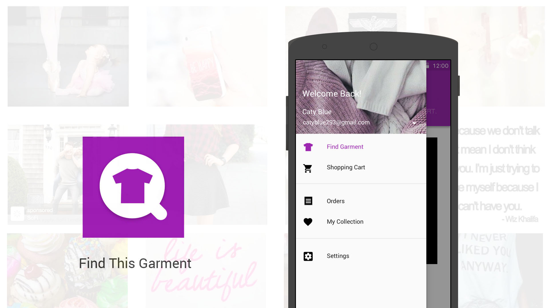
Designed iPad App. 2013
Except those above, there are also some memorable or tough issues.
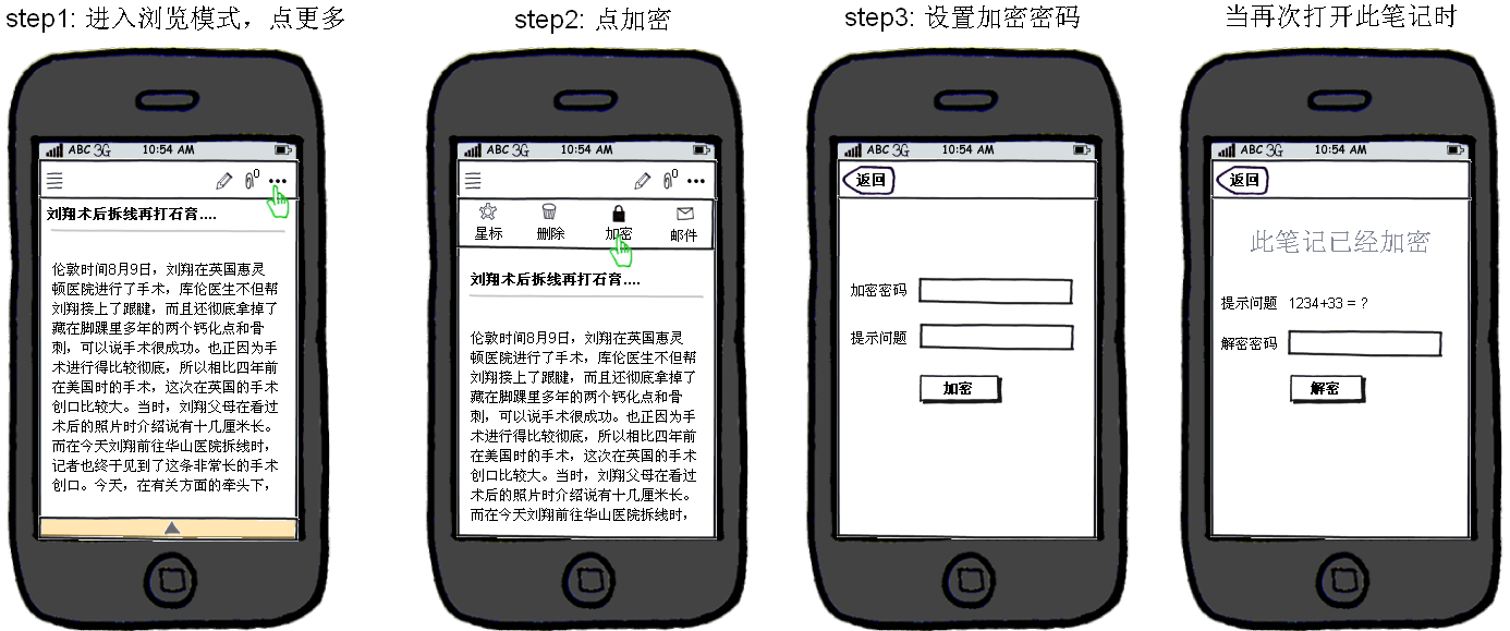
• How to enhance capture experience? Designed a chrome plugin that aims to help users easily capture any passage from a web page.There are 2 modes of auto capture mode and manual mode. Simply users just need to click twice during whole flow, once for launch and another for done in auto mode. They don’t need to think, we will filter the information leaving only text and photos. And users could also drag to choose the section they want in manual mode.
• Use tag or folder? During interview, it’s really impressed me that most people don’t have habit or don’t have good method to manage their note. We also found China users are not used to use tag. But are used to Windows tree structure, so we kept the tree structure in desktop client to reduce users’ learning cost.
• How to help users manage notes? On desktop client, there’s a dynamic recommend tags area that shows the keywords the machine learnt from the note that user just created. Users could just click those tags to add to note. This is simple to “manage” notes than wait for users’s initiative.
• I suggested to put some default folder and tags for users which might engage users and help them to know what to note. Tags like @home, @office, @phone, &email and &done.
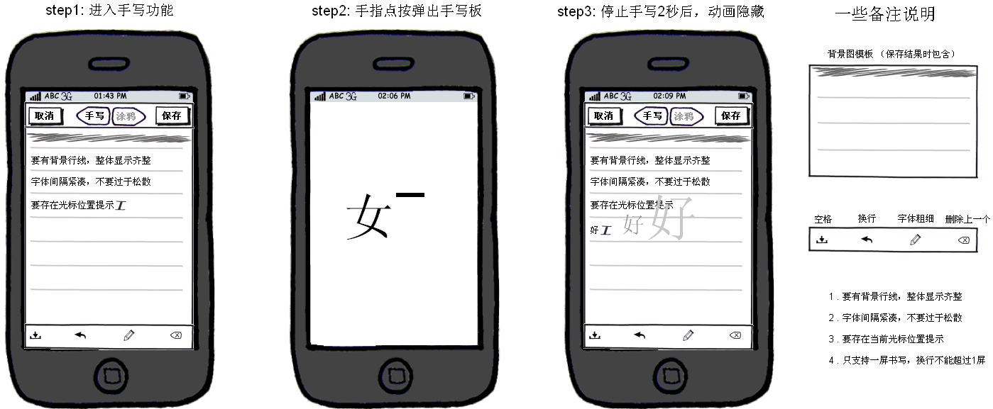
• How to be a companion? I designed a widget that focused on the key features and takes lesser screen space. Users could use keyboard and shortcuts to call for creating, browsing note list or search. It’s a kind of powerful meno that you could also insert photo and sound. And users could pin the notes to their screen as well.
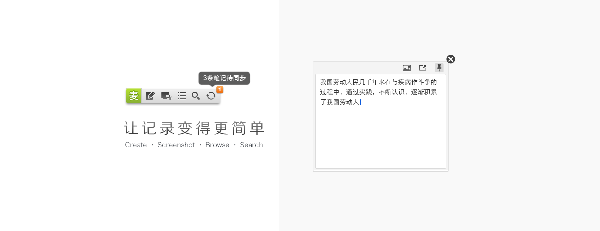
• Friendly Feedback. There’s icons stand for “syncing” and “Not synchronised”on each note created so that users know the notes’ status
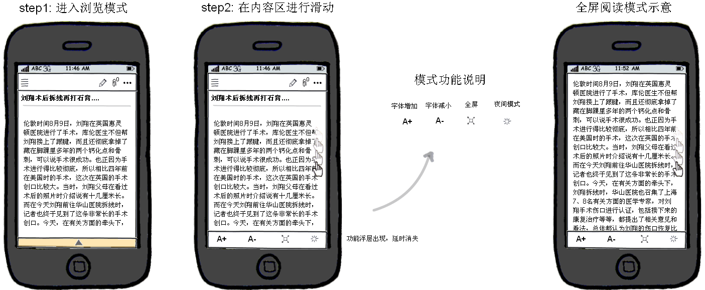
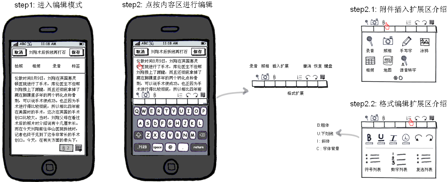
• Focused on Details? Increase the edit and read area as large as possible. The navigation bar will be hide when scrolling up, and will show when scrolling down.
• Users has habit on using shortcut “Ctrl+S” to save any document in most softwares. We also kept this shortcut for them. As a trigger, once users used “Ctrl+S”, the note will be saved in local environment and be uploaded to server.
Cross platform design
Go with native applications. The matter is, users on different platforms have different expectations. What users usually do on mobile phone they may not do on desktop client or website. To respect difference experience on different device, we decide to design the apps based on the features and interface elements specific to the platform, and to make the user feel right at home on every possible device, and try to keep the consistency at the meanwhile.
Research
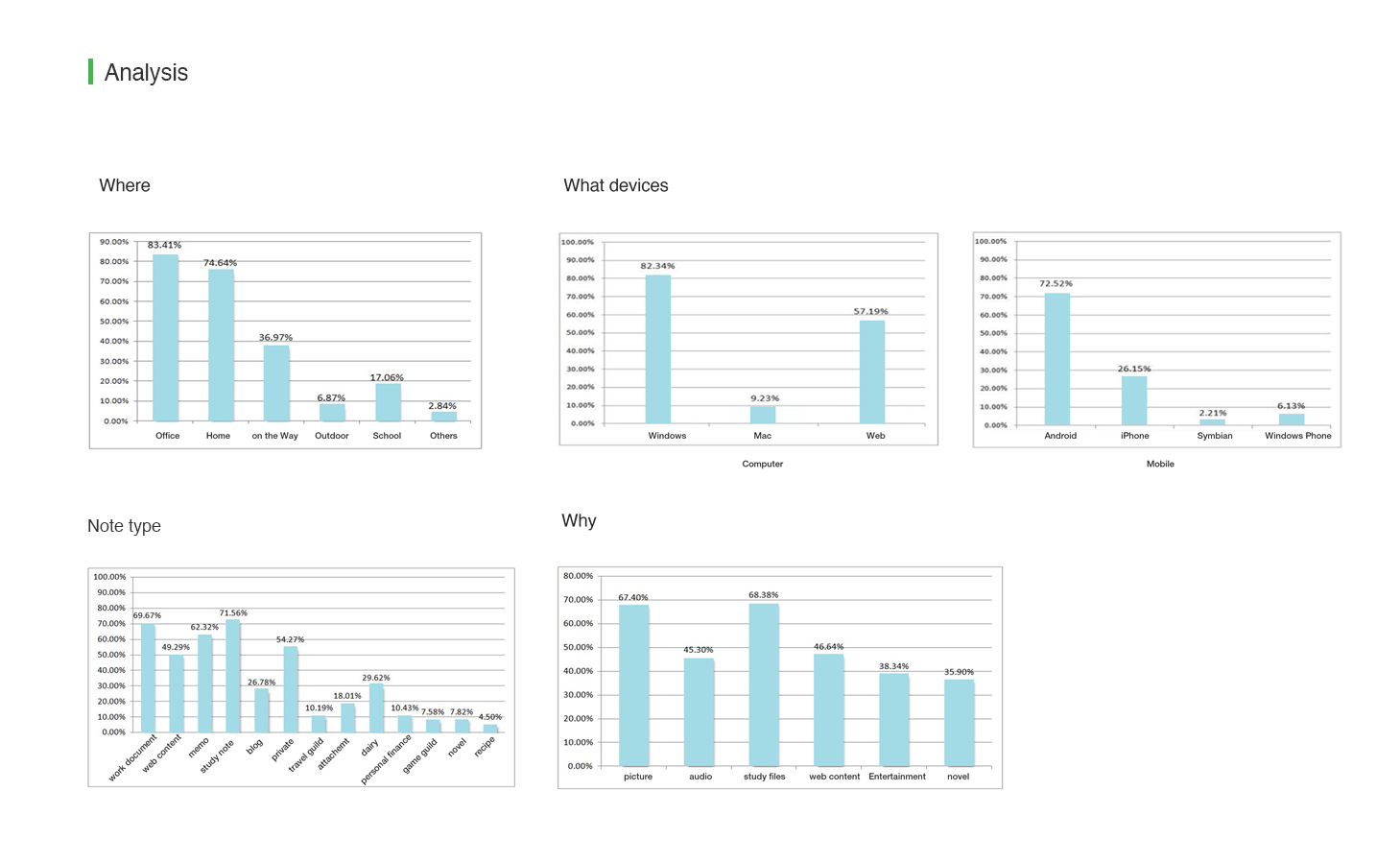
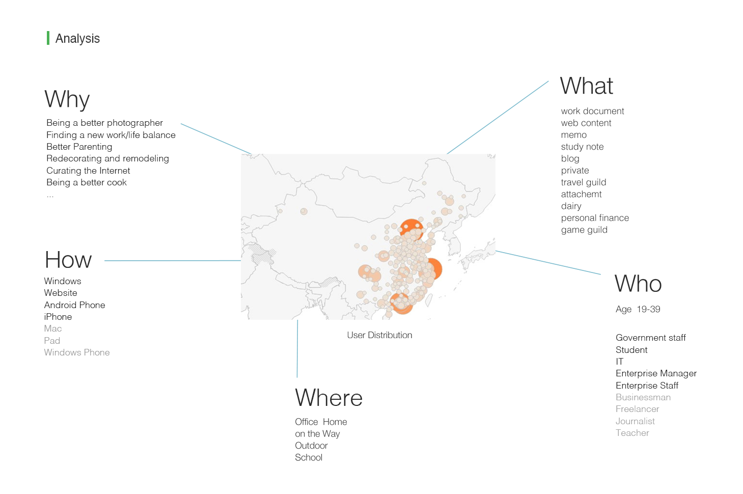
Goal: Understand our potential users and their exceptions, identify what our product could do to help them.
Who are the audience?
What is ’Note’ to you?
What device do you use to note?
How do you note?(behaviour)
Why do you want to note?
Where do you create note?
What you expect in a note app?
What do you note?
……
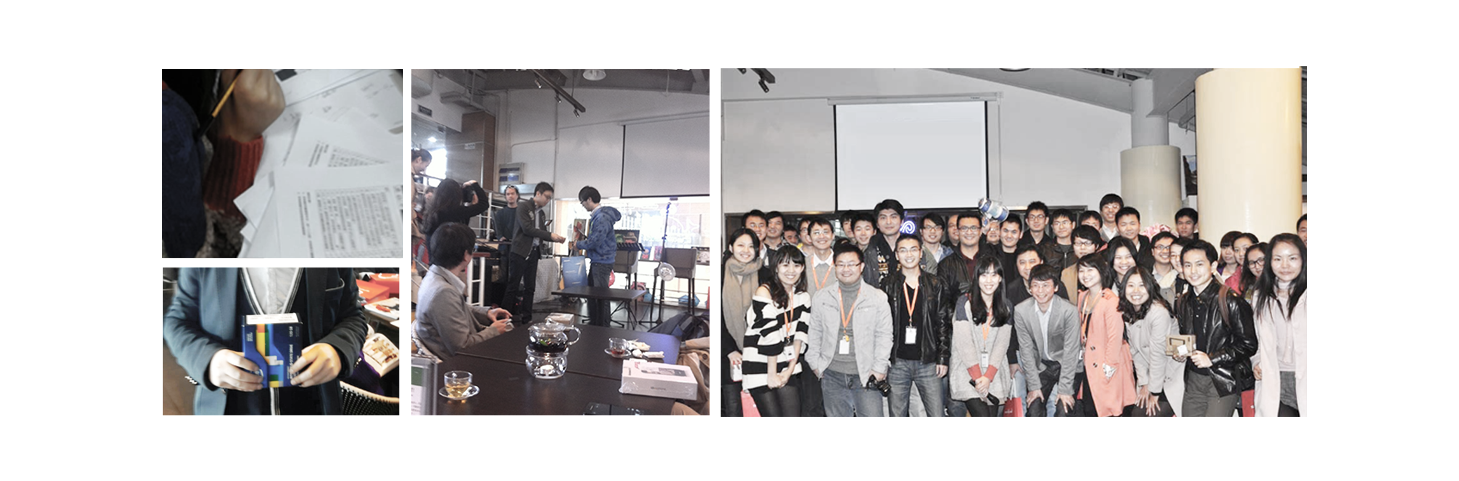
1. Stakeholder& team Workshop
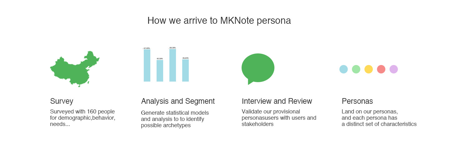
I had brainstorming with stakeholders to understand business requirements and the vision. We shared ideas and told stories on Who…What…Why… How… We assume initial spectrum of potential users.
2. Surveys & Analysis with 122 Samples
I planned and conducted the online survey, which helped a lot to find out the answers to to know our product’s audience. I sent online/offline survey papers to around160 people and we have 122 people’s feedback as samples. They were chosen random from 16 years old to 45 years old, from high school students to government staffs.
• The Psychological. From our survey, we got to know people are more comfortable to describe a note app with words like “Privacy”, “Safe”, “Fast” “Accessible”and “Easy to Use”… which reflect their potential needs.
• The Platform Choice. People have different habit and focus on mobile and desktop app:
- On Desktop – Users need to create and manage complex information, such as writing an index for a book . “It’s more productive and easy to write with a keyboard.”
- On Mobile – Users tend to read and browse information instead of creating. “It’s more personal and convenient in daily life.”
- For web client and desktop client, the web app is more convenient and acceptable to users, since they don’t have to install any programme.
- People who used to note were interested in cross-platform note app, they used different apps on different device to capture, create or manage their notes.
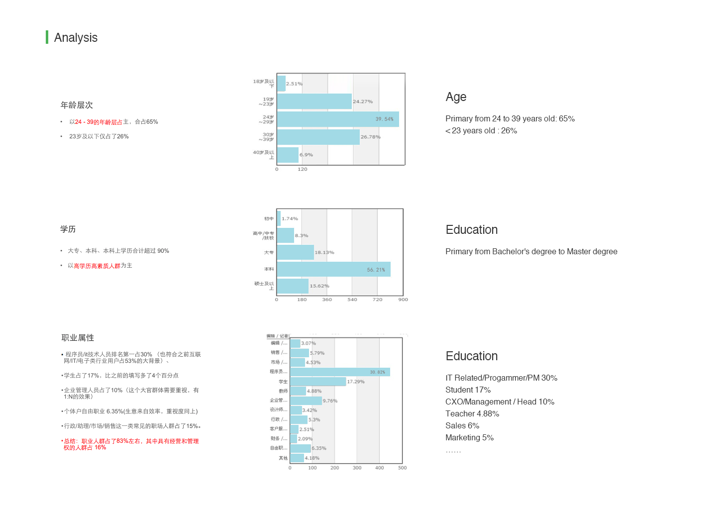
• The Demographic. The age, education and occupation are also taken as reference.
- People who around 24 to 39 years old are the major users.
- People who work and educated from college often use note than unemployed people or lower educated people.
3. Search&Download Comparative Apps and Analysis
We are also the audience of note apps, I almost save and write everyday with Office Suit. To have empathy with our audience, I put ourselves as a normal user and tried several apps from One note, Evernote, Microsoft word, Notepad, Google Docs, Box and email apps. We wanted to find out what their advantages and disadvantages are.
Strategy
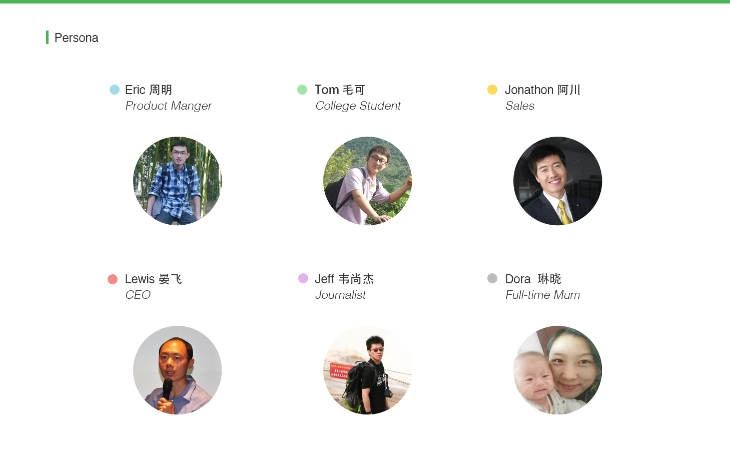
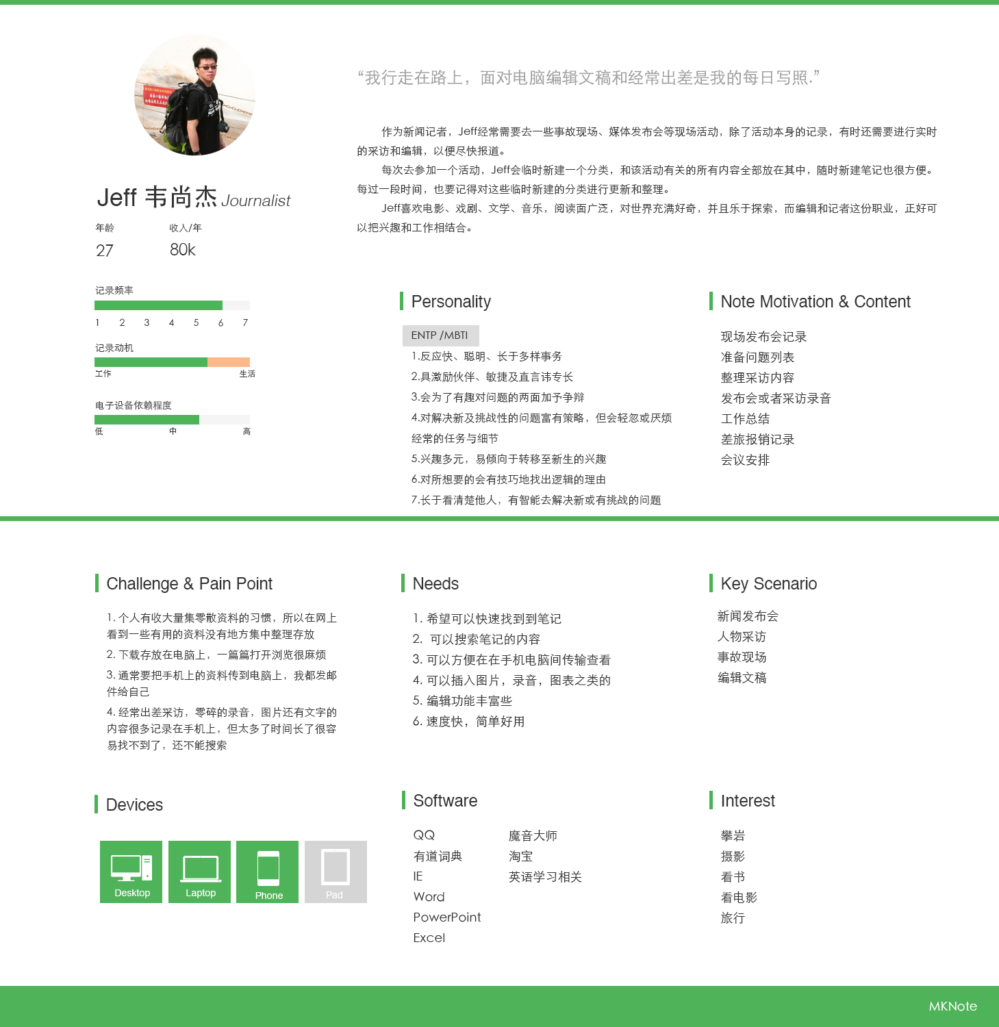
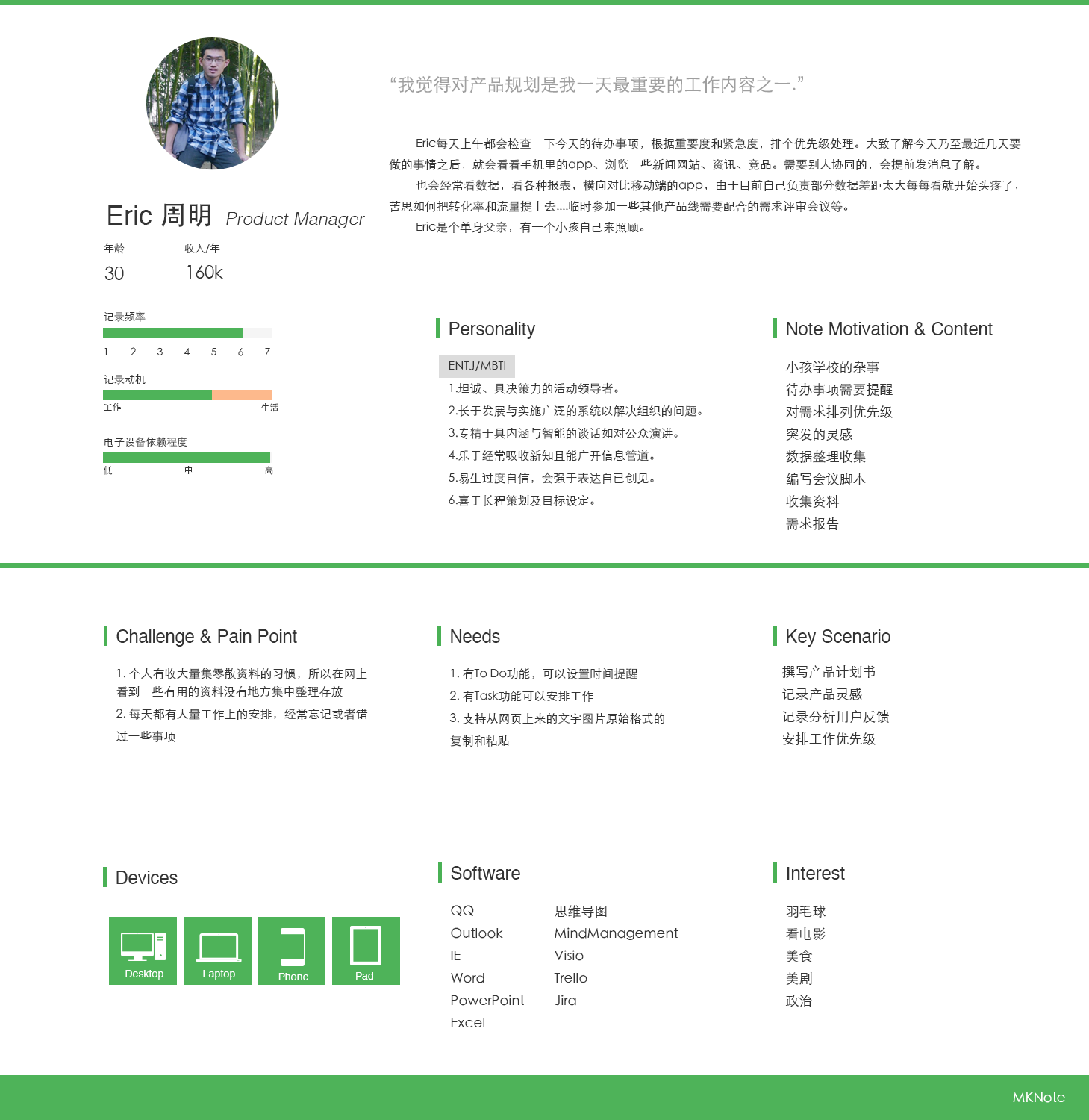
1. Persona
With identify extremes in user behavior, group similar respondents and review our initial spectrum of potential users. I planned and executed 1:1 interview with 2 respondents per persona to see patterns of behavior, to customize the persona based on their attitudes, behaviors, and motivations…
And by getting all of the stakeholders involved to have them understanding of the users, providing opportunities for feedback, ensure to define a higher quality persona. This is not full-fledged personas, but it will start to reveal clustering and patterns of behaviors that helps us to know our users.
What are their responsibilities?
What are their challenges?
What are their needs and wants?
What does a day in the life of this persona look like?
An interesting part during the 1:1 interview, the user’s a blogger, he have habit on notes daily. He used to run around 5 notes apps for different scenario. Some apps were used for capture fragments and ideas on his mobile, and some were used for editing and management on desktop. He also used another ToDo to list the most important notes. During interview, he told me that he need to delete some of the notes which were already quoted in his passage or seems unnecessary to him at the moment, since the space of notes app is limited. I’m surprised by his amount of notes and really feel pain for him at mean while.
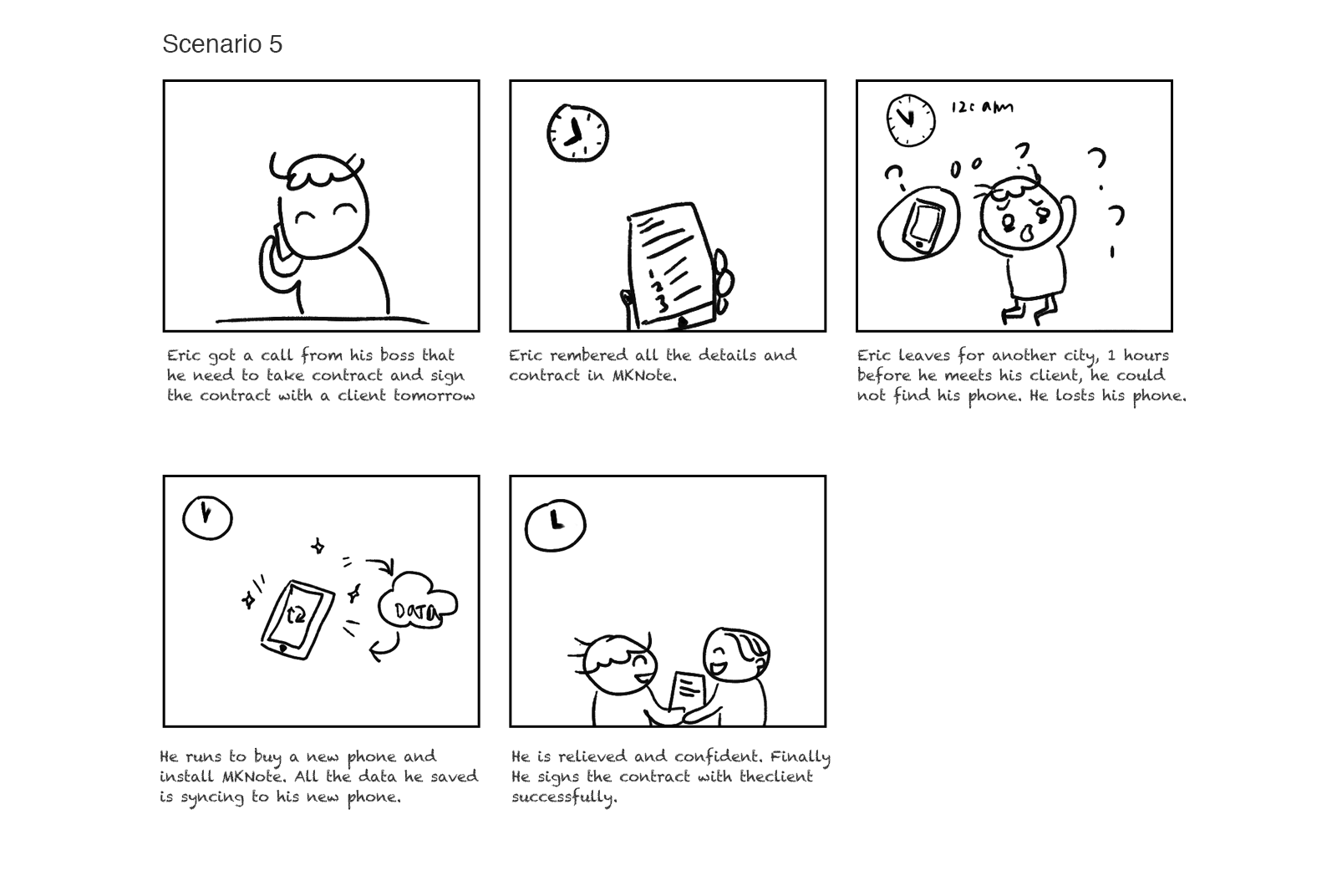
2. Scenario & Story Board
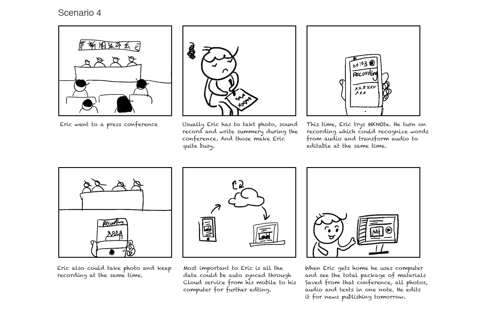
Through the research and persona, we could focus on the scenarios. A scenario helped us to know what users want and proceed a product based on empathy with our users.
3. User journey
I made this user story mapping to help team to know the users journey and make release decisions.
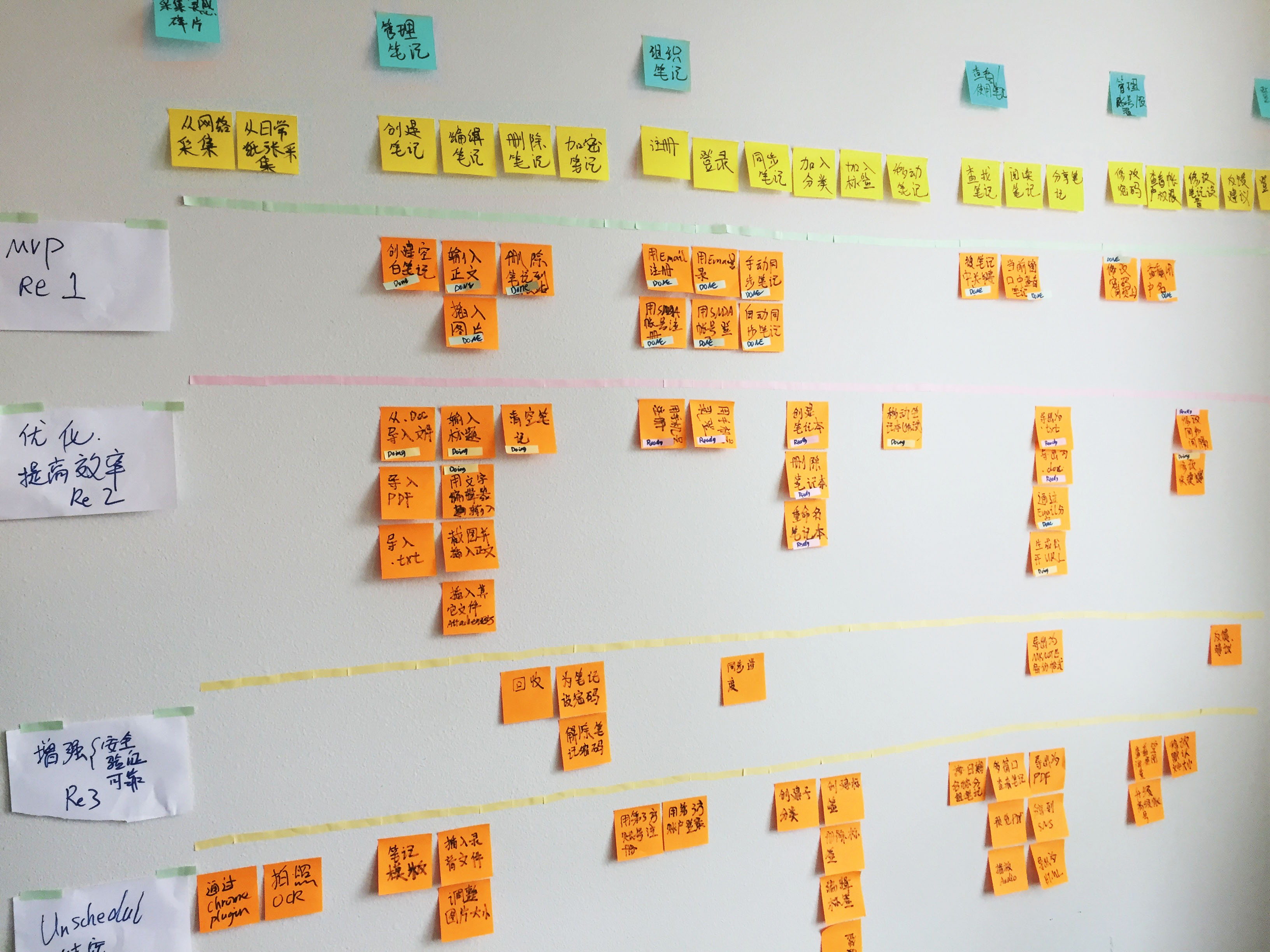
4. Identified MVP features based on our priority and tech constrains
By considering users’ perspective, business objective and technical architecture, the team align on some directions.
5. Brand Strategy
Another challenge is we need to create the business strategy as Unique Value Point. We had brainstorming and research in to what makes our product different with stakeholders. And we developed some principles for our product, which would help us to align on the designs.
“Unique Value Proposition: A single, clear compelling message that states why you are different and worth buying.” (Steve Blank in The Four Steps to the Epiphany)
• For people who need to remember something some where
• Who are dissatisfied with offline note service
• Our product is a cross platform personal note book
• That provides creating, editing, saving, managing an cloud syncing notes
• Unlike traditional note or documentation applications.
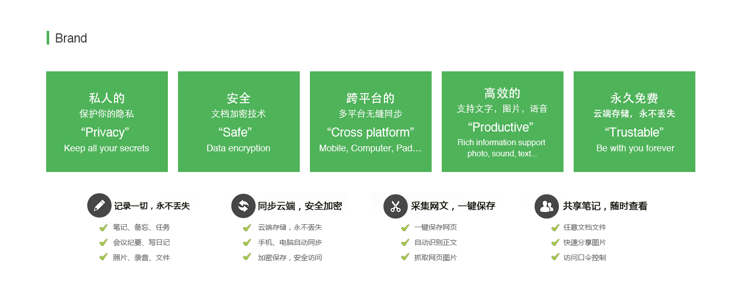
“Privacy” – Keep all your secrets.
“Safe” – Data encryption
“Cross platform” – Mobile, Computer, Pad…
“Productive” – Manage, complex information support with photo, sound, text…
“Trustable” – Be with you forever
Design
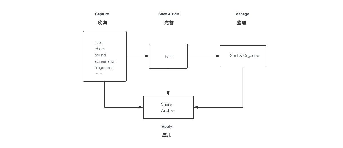
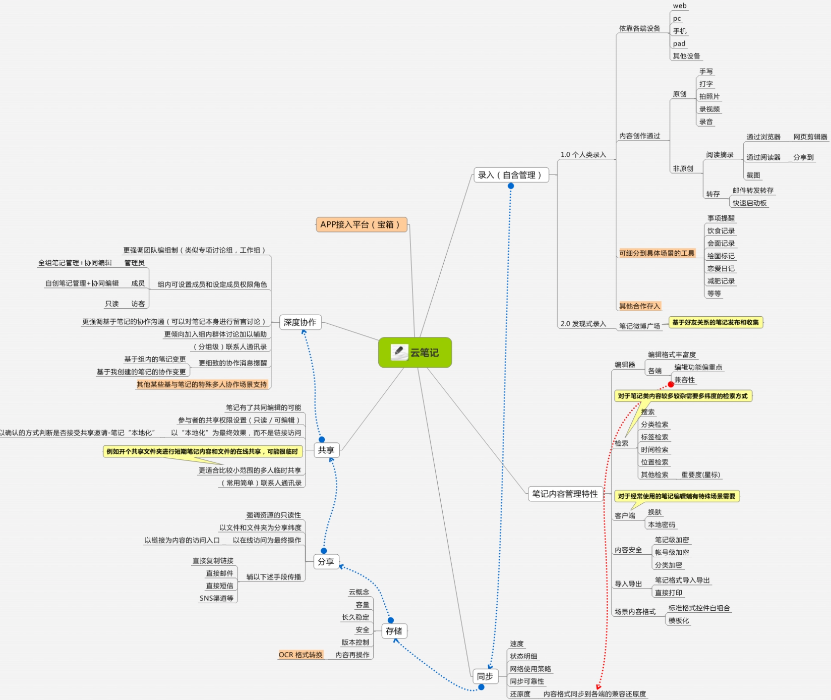
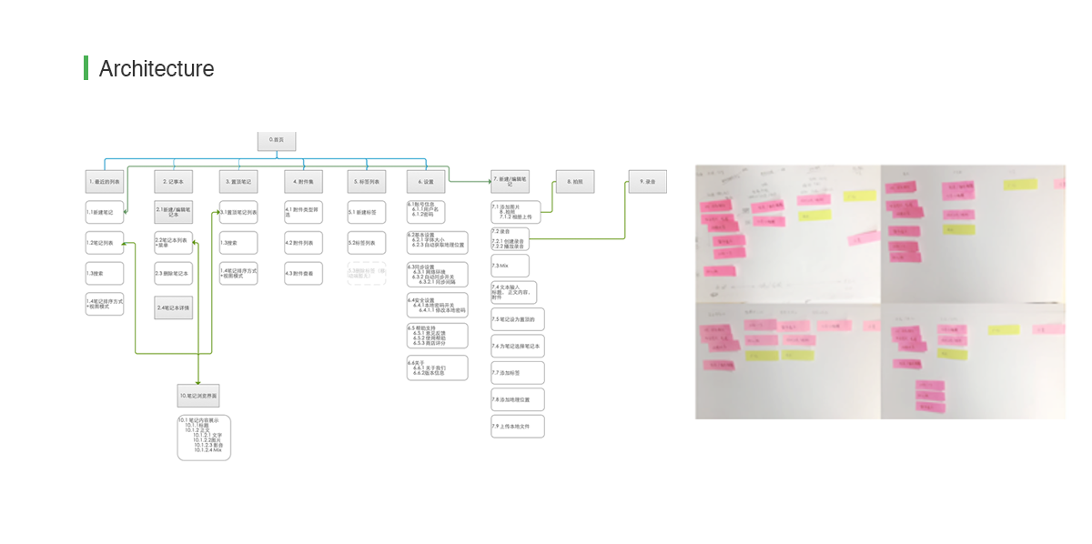
1. Architecture
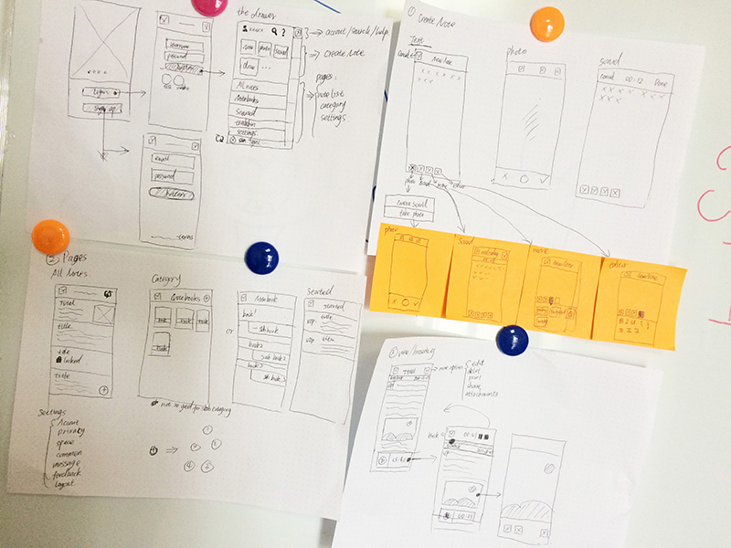
2. Sketching
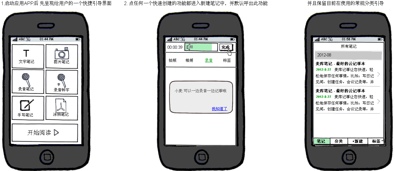
3. Wireframe
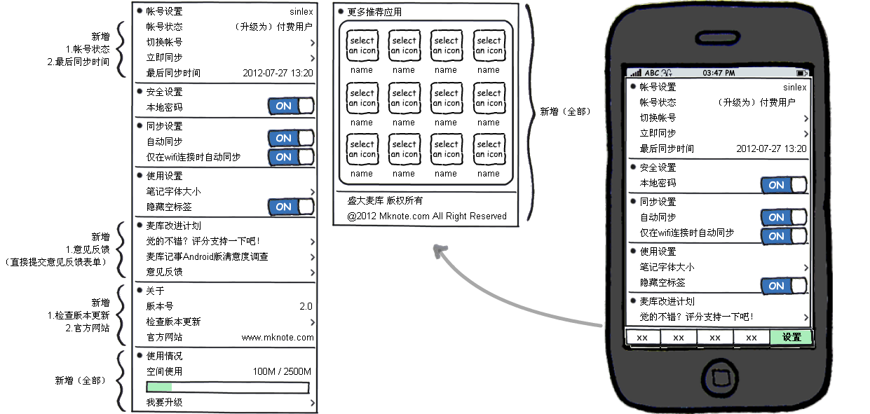
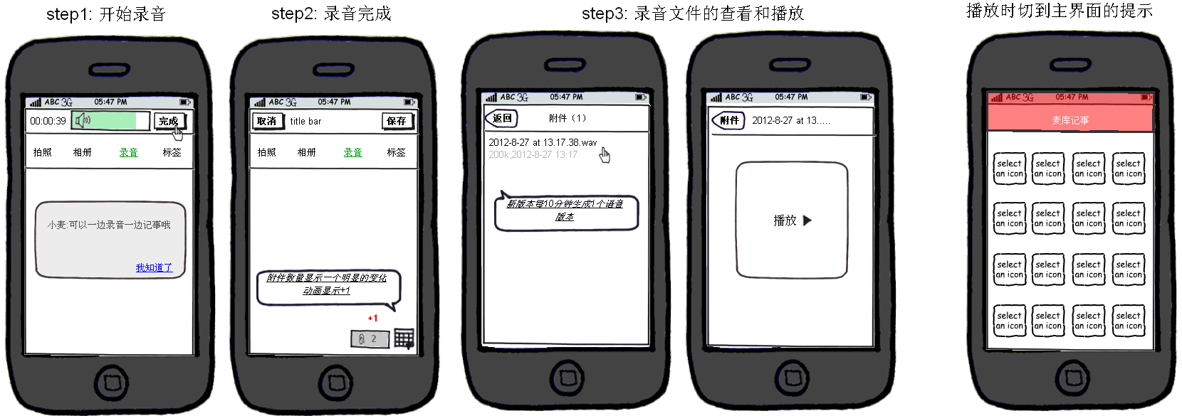
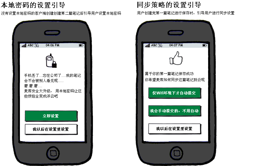
I generated wireframes to help the ideas go to concept design. The wireframes were made and updated by me in Axure or Balsamique. For mobile, my design focused on reading and creating fragment memos experience.
4. Visual Mockup & Prototype
Demo Prototype for iPhone: http://invis.io/R73CI0EHC
Visual Mockup for iPhone App:
5. VI
In our research, blue and green colour are widely acceptable by most audience. To the users, green stands for healthy and safe that makes users feel reliable and comfortable.
Implementation & Ilteration
1. Produced UI specification and image materials , kept on reviewing the design to make sure it aligns the UX guidelines.
2. Worked with the development and test team to ensure the design is implemented according to the specification.
3. With many iterations, we relied on usability testing to validate our design decisions.
• We put online survey links or recruit links as a button on our application,s so that we had a efficient channel to keep communication and gather feedback with our users.
• I invited testers random from our contact book that build through the survey or feedback channel. Sometimes talked online through QQ or Skype with rough prototype, and sometimes tested with released feature face to face to validate the design.
• With each version release, we accumulated lots of “loyal users”, that we have lots of passion in joining our offline activity, online survey or usability testing.
The MKNote first Cross platform version (iOS, Desktop, Website) launched on Apple store and available download from website(www.mknote.com) in Dec, 2011. After that we had iterative and had released several versions.
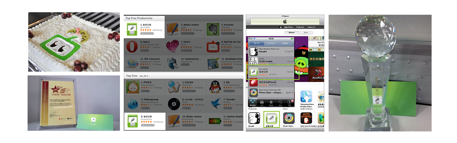
We got over 1 million registered users in the next following years.
MKNote iOS App was recommended by Apple Store(China) in productive category.
We got both tons of feedbacks, I’m so into this product no matter we got encourage comments or criticism on designs and features 😀
This product has helped users and has brought values to them.
1. Cross platform experience. I practiced and benefited from iOS, Mac, Android and Windows 8 .
2. Intel Ultrabook project experience. Got a chance to learn and design the MKNote Windows 8 app as one of the initial apps for Intel Ultrabook in China Market.
3. Always show feedbacks and details to users during and after a syncing process. Syncing is the miracle happens moment, don’t ask users to guess.
4. Users are “lazy”, don’t rely on their initiatives. Help them.